This case study is a work in progress — more updates coming soon.
Overview
Greenbyte (now part of Power Factors) is a company that provides software for renewable energy management – essentially a platform for wind farm and solar farm operators to monitor and optimize their assets. I joined Greenbyte as their first UX Designer, tasked with improving and expanding their flagship product, known as the Greenbyte Energy Cloud. This is a web-based dashboard and analytics tool used by stakeholders in the renewable energy sector (like asset managers, operations engineers, and analysts) to keep track of the performance of wind turbines, solar panels, and other renewable installations.
Goal
The main goal of the project was to enhance the usability and clarity of Greenbyte’s web application while it was growing in features and scale. The product needed to serve as a one-stop hub – a “single pane of glass” – where users could see everything from real-time performance data to long-term trend analyses of their renewable energy portfolio. As the first UX hire, my goal was also to bring a user-centered design process into an environment that had been very engineering-driven. That involved conducting user research to understand how customers were actually using the platform and where they struggled, then translating those insights into design improvements.
In summary, the goals were:
- Improve Data Visualization: Make complex data (energy output, weather data, equipment status) easy to digest at a glance through better visual design and organization.
- Streamline Workflows: Users should be able to find the information they need quickly – whether it’s checking today’s performance or investigating an alert from last night. The navigation and UI structure needed refinement as the product had grown organically.
- Scalability: Ensure the design could handle more data (as clients add more turbines or new solar farms) and new features (like predictive maintenance alerts, etc.) without becoming cluttered or confusing.
- Consistency: Introduce a coherent style guide for UI elements (buttons, charts, forms) so that newly developed modules or features would have a consistent look and behavior, reducing the learning curve for users.
Challenges
- Data Complexity: The Energy Cloud ingests a ton of data – from live turbine outputs measured in kW, to wind speeds, to maintenance logs. One challenge was presenting multiple data streams together. For instance, an asset manager might want to correlate a dip in power output with a wind lull or a technical fault. That means the UI might need to show a power graph, a wind graph, and an event timeline together. Designing a dashboard that can layer information without overwhelming the user was a key challenge.
- User Roles: There were different types of users with different needs. A high-level manager might only care about KPIs and summaries (“Are we on track to meet monthly production targets?”), whereas a field engineer might dive into details of a specific turbine’s performance. Catering to varied use cases through one interface (perhaps via customization or role-based views) was tricky.
- Legacy vs. New: The product had an existing interface that current customers were accustomed to, but it needed improvement. We had to introduce changes gradually and thoughtfully to avoid alienating users who had learned the quirks of the old system. Balancing the need to modernize with the need to not disrupt ongoing operations was critical.
- Keeping it Simple: Renewable energy folks are often engineers by background; they appreciate detail and accuracy. However, even they can get lost in too much information. One of my guiding challenges was summarizing complex calculations or statuses into clear, actionable indicators (think red/yellow/green status lights, or anomaly alerts) without dumbing it down. We needed to present a simplified view with the option to drill into details on demand.
- Remote Monitoring Nature: Users of Greenbyte’s platform could be anywhere – in an office, or on the go checking from a tablet. The design had to be responsive and functional on different screen sizes. Moreover, the content sometimes included big maps of wind farm locations or large tables of turbines, which are hard to squeeze into a small screen. Crafting a responsive design for such rich content was a challenge.
Solution & Key Features
Dashboard & Summary Views: We created a customizable dashboard where each user on login could see the key metrics important to them. This might include total energy produced today vs expected, current active alarms (if any turbines or panels have issues), and maybe a quick weather overview for their sites. We used widgets/cards layout – each card showing a summary stat or chart. Users could rearrange or configure which widgets they see. For example, a user could have a “Fleet Summary” widget showing aggregated performance of all assets, and below that a “Top 5 Underperforming Turbines” widget listing which units are generating significantly less power than expected. This immediate overview directs users to where they might need to pay attention.
Navigation & Information Architecture: We reorganized the menus to be more intuitive. The app likely had sections like “Overview”, “Sites”, “Turbines”, “Analysis”, “Reports”, etc. We grouped related pages and gave them clear labels. A consistent sidebar or top navigation allowed switching between a high-level portfolio view and drilling down to a specific site or turbine. Breadcrumbs or dynamic titles helped users know where they were (“Greenbyte > Wind Farm Alpha > Turbine 5 > Performance Graph”). This way, users could traverse from a broad view to a specific detail and back without getting lost.
Data Visualization Improvements: We revamped many of the charts and tables. For time-series data (like power output over time), we implemented interactive charts where you could hover to see exact values, toggle different data series on/off (e.g., show wind speed on the same chart as power output), and zoom into specific time ranges. We chose color schemes that are colorblind-friendly and clear in print (some users export charts for reports). Alerts or anomalies on graphs were marked with icons (say a warning icon on the timeline) – clicking it might show “Turbine tripped off at 14:05, auto-restarted at 14:10.” Tables (like a list of turbines with various metrics) were made sortable and filterable, with conditional formatting (e.g., red text for values that are out of expected range). For maps (if the app had a geographical map of assets), we used intuitive markers and tooltips – for example, a pin for each site colored by its status (green if all turbines are fine, red if any are down).
Alerts & Notifications: We designed an alert system where critical issues bubble up. This could be a panel or notification icon that shows the number of active alarms. Clicking it opens a list of notifications like “Turbine 12 – Generator Overheat – 5 mins ago.” The user can click that to jump to the specific turbine’s page for details. By surfacing alerts, we ensured that users don’t miss urgent problems. We also allowed users to acknowledge or snooze alerts in the interface, creating a basic workflow for issue tracking.
Consistency & Style Guide: I introduced a style guide (a mini design system) for Greenbyte’s UI. This included standard colors (for things like normal vs warning vs error states), typography scales (consistent font sizes for headings, subheadings, etc.), and reusable components (navigation bars, card layouts, form elements). We applied this style consistently across existing and new pages. For example, all forms (like setting up a new site or editing turbine info) followed the same layout and behavior, which reduces user confusion. This internal design system also helped the devs implement features faster and with fewer discrepancies.
User Customization: Recognizing different users have different needs, we added some customization options. Aside from the main dashboard configuration, even on detailed pages we allowed toggling between views or saving preferences. For instance, an analyst might always want to see data in metric units vs imperial; we let them set that preference. Or a user might want a dark theme due to working at night in a control room – so we considered offering a light/dark mode toggle for comfort. Small touches like this make the tool feel more tailored and friendly to each user.
Impact
The UX improvements to Greenbyte’s Energy Cloud had a notable impact on both user satisfaction and the business:
Existing users found the new layout much easier to navigate. Tasks that used to be convoluted (like generating a specific performance report) became more straightforward, which in feedback surveys translated to higher satisfaction scores.
We saw increased usage of the platform’s advanced features. In the past, some users only used Greenbyte for basic monitoring and would export data to Excel for deeper analysis, possibly because the in-app analysis tools were hard to use. After redesigning the analysis section with better charts and comparisons, more users started doing their analysis directly in the platform (the telemetry we gathered indicated a rise in time spent on the analysis page and fewer data exports). This is a win because it means the platform is providing value end-to-end.
New customer onboarding became smoother. Salespeople reported that demos of the platform were more impressive with the refreshed UI, as it looked professional and modern. Also new clients learned the system faster, reducing training time. I recall one particular new user saying, “I’ve used other energy management systems, and Greenbyte’s is the most intuitive by far.”
Internally, the adoption of a design mindset meant that as new features were added, they were done more thoughtfully. I worked closely with product managers and developers, and they began to include UX considerations in early stages (for example, involving me in brainstorming how a new “Energy Forecast” feature should look and work, not just bolting it on). This collaborative culture shift improved product quality overall.
On the qualitative side, the platform started to feel “cohesive.” Before, some parts of the UI felt like separate tools stitched together (because different engineers built them at different times). After our work, users felt like everything was part of one unified application. Consistent design reduced the cognitive load – once you learn to do one action, you can apply that knowledge elsewhere.
Conclusion
Working on Greenbyte’s dashboard was a fulfilling experience because it combined data-heavy design with a meaningful domain (clean energy!). We managed to make a complex tool easier and even a bit enjoyable to use, which in turn helps the renewable energy sector operate more efficiently. The visualizations and dashboard we improved help experts catch issues in wind turbines faster or spot trends in energy production, ultimately contributing to more uptime and better energy yields.
From a personal perspective, being the first UX designer at the company taught me how to advocate for users’ needs and demonstrate the value of design. Small, thoughtful improvements – like renaming menus or improving graph readability – helped users work more efficiently and built internal trust in the design process.
One of the more difficult aspects of the role was working within a challenging leadership dynamic. The design department was heavily influenced by a founder with a very controlling approach and limited openness to collaboration. This led to friction, frequent clashes, and at times, a frustrating work environment for those of us working closely with him. It pushed me to develop a thicker skin, improve how I communicate under pressure, and find ways to navigate conflict constructively. While not easy, those experiences taught me as much about resilience and diplomacy as they did about design.
As renewable energy assets grow in number and data, the importance of clear and effective UX only increases, and I’m proud to have contributed to that early on at Greenbyte. Later, Greenbyte was acquired and rebranded as PowerFactors — a testament to the company’s long-term relevance in the renewable energy space.
Selected Works
Tillväxtverket - Kompass Design SystemDesign System
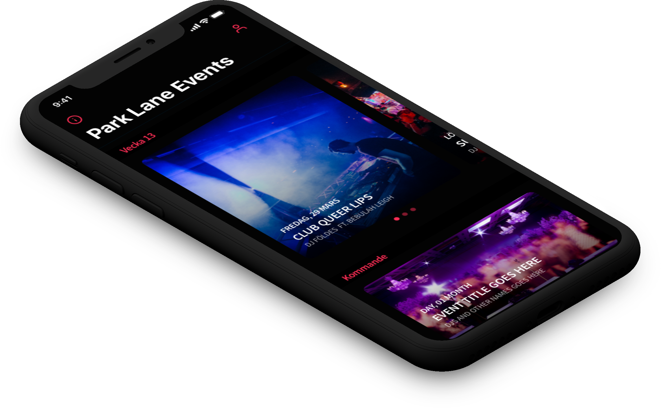
Park LaneMobile App
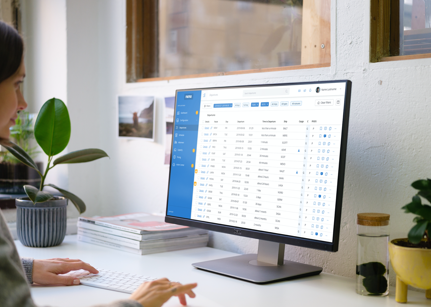
Stena Line - NemoAdmin Dashboard
Lighthouse Design SystemDesign System
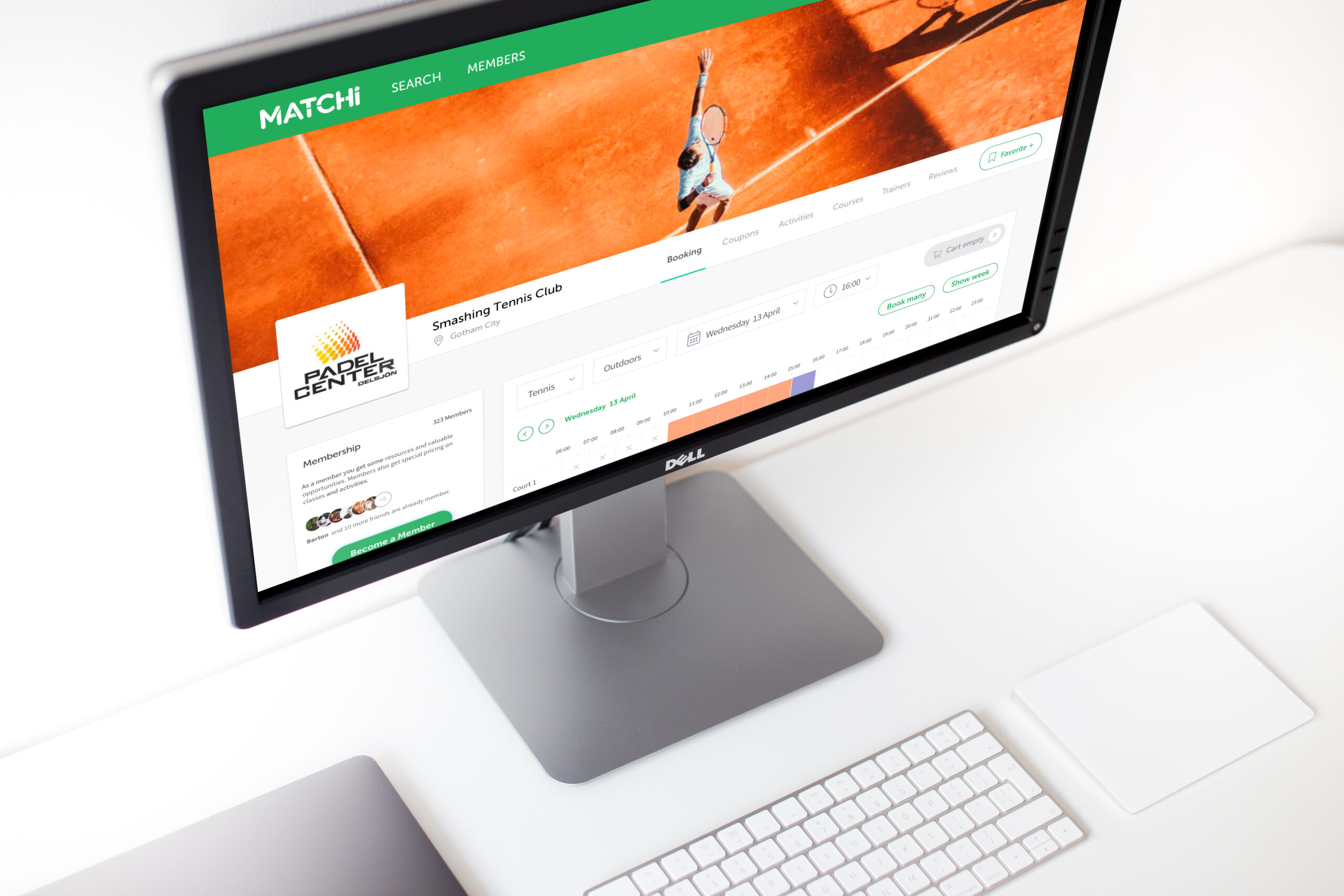
MatchiWeb App
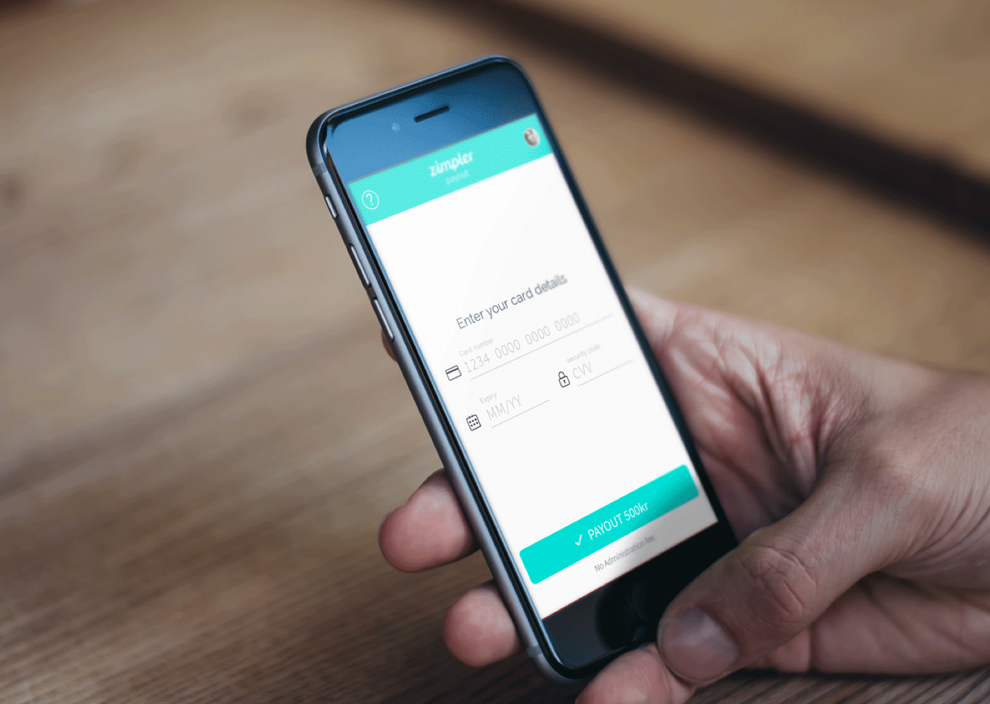
Zimpler - Mobile PaymentsResponsive Design
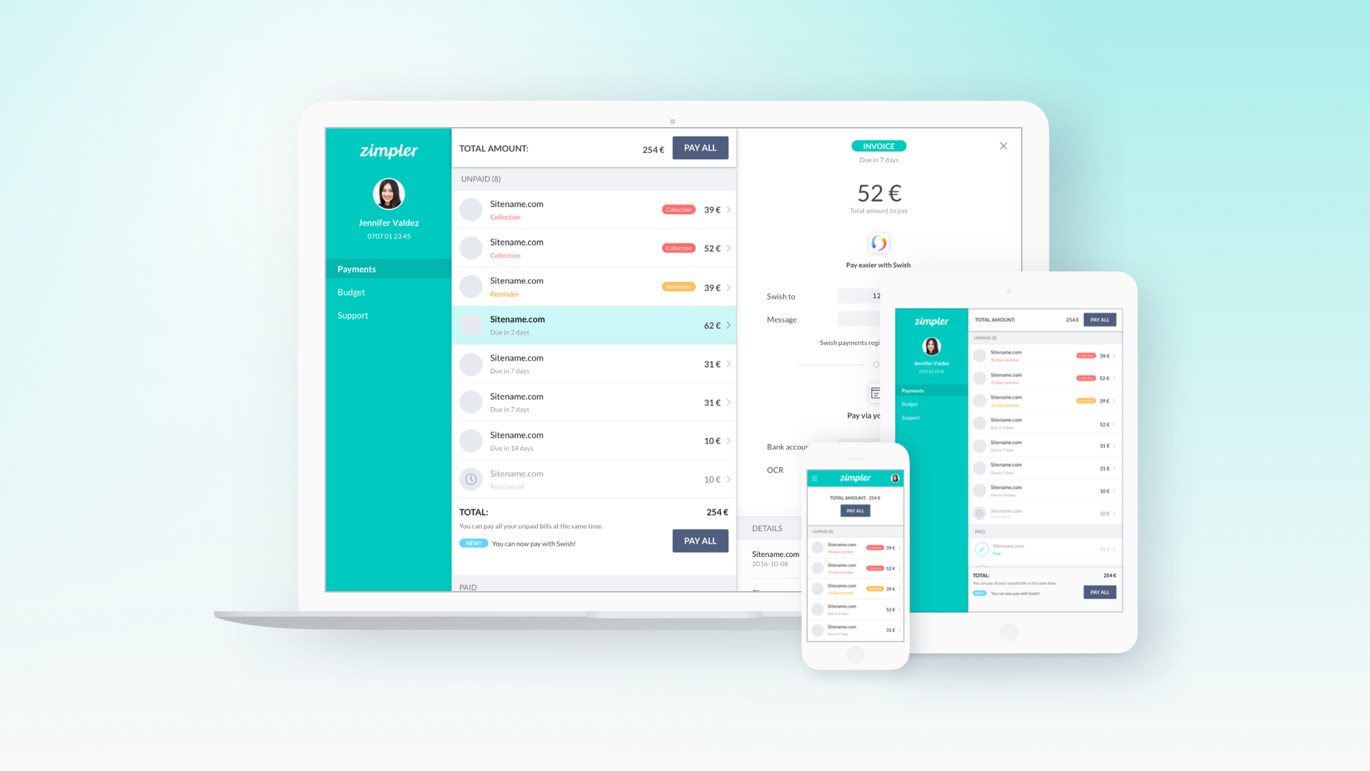
Zimpler - User PortalWeb App
QitchMobile App
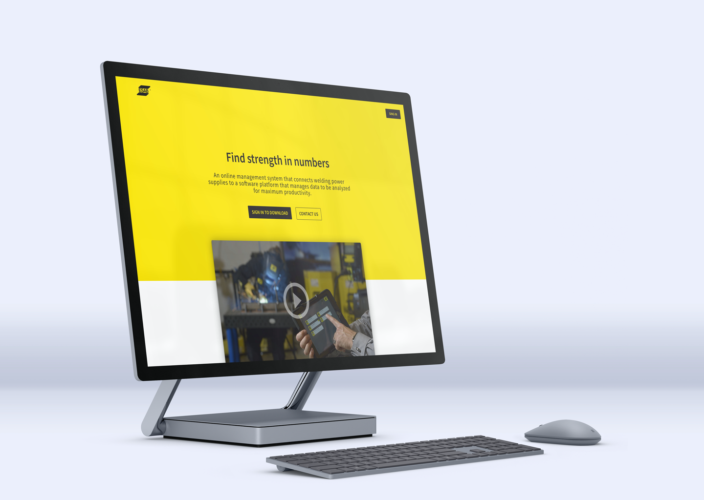
Esab - WeldCloudWeb App

Butlr.net - The Help NetworkWeb App
Contact
If you’re looking to hire a product designer, I’d love to chat. I particularly enjoy working with small to medium-sized companies that have an excellent culture. Let’s connect!