Overview
Park Lane, one of Gothenburg’s most popular nightclubs, wanted to create a better way for guests to join VIP lists and reserve tables. I collaborated with SharpMind digital agency on this project, leading the UX process and designing all the UI for a pair of mobile apps – one for club guests and one for staff. We worked closely with the client and iterated weekly, testing designs with real users to ensure the app would truly meet the club’s needs..
Challenge
The nightclub’s staff was overwhelmed by guest list requests coming in from every direction – text messages, Facebook posts and messages, WhatsApp, Instagram, email, and more. Promoters maintained their own lists as well. Managing all these channels had become unmanageable: people were slipping through the cracks, and there was no clear overview or control of who was on the VIP list on a given night. The core challenge was to streamline this chaotic process into a single system.
Solution
We designed an easy-to-use mobile app that centralizes the guest list and table bookings. Partygoers can view upcoming events and submit a request to be on the guest list (or book a table) right from the app. They can add up to five friends to their request and get notified via push notification when their status is updated. On the other side, club promoters, managers, and bouncers use a dedicated Staff App (and an admin dashboard) to review and manage all incoming list requests in one place. This centralized approach replaced the mix of messages and spreadsheets with one coherent system.
Research methods
Information Architecture
Market research
Prototype testing
Persona
Design elements
During the design and development, we continually tested the app with target users and gathered feedback. This iterative process helped us refine the user experience – from simplifying flows to choosing wording that the nightlife crowd would understand. We also had to establish a mini design language for the app: Park Lane had only a logo and a preference for a black background (like their website) but no style guide. So, we quickly created a color scheme inspired by their existing marketing and chose a native font stack for optimal readability on iOS and Android. After client approval, these design elements guided the app’s look and feel. (In the final stretch before launch, the client decided to change the font – against our advice – to align with their brand, showing that design is always a collaborative negotiation!)
Brand Colors
System Colors
Gray Scale
Typography

Icon Set
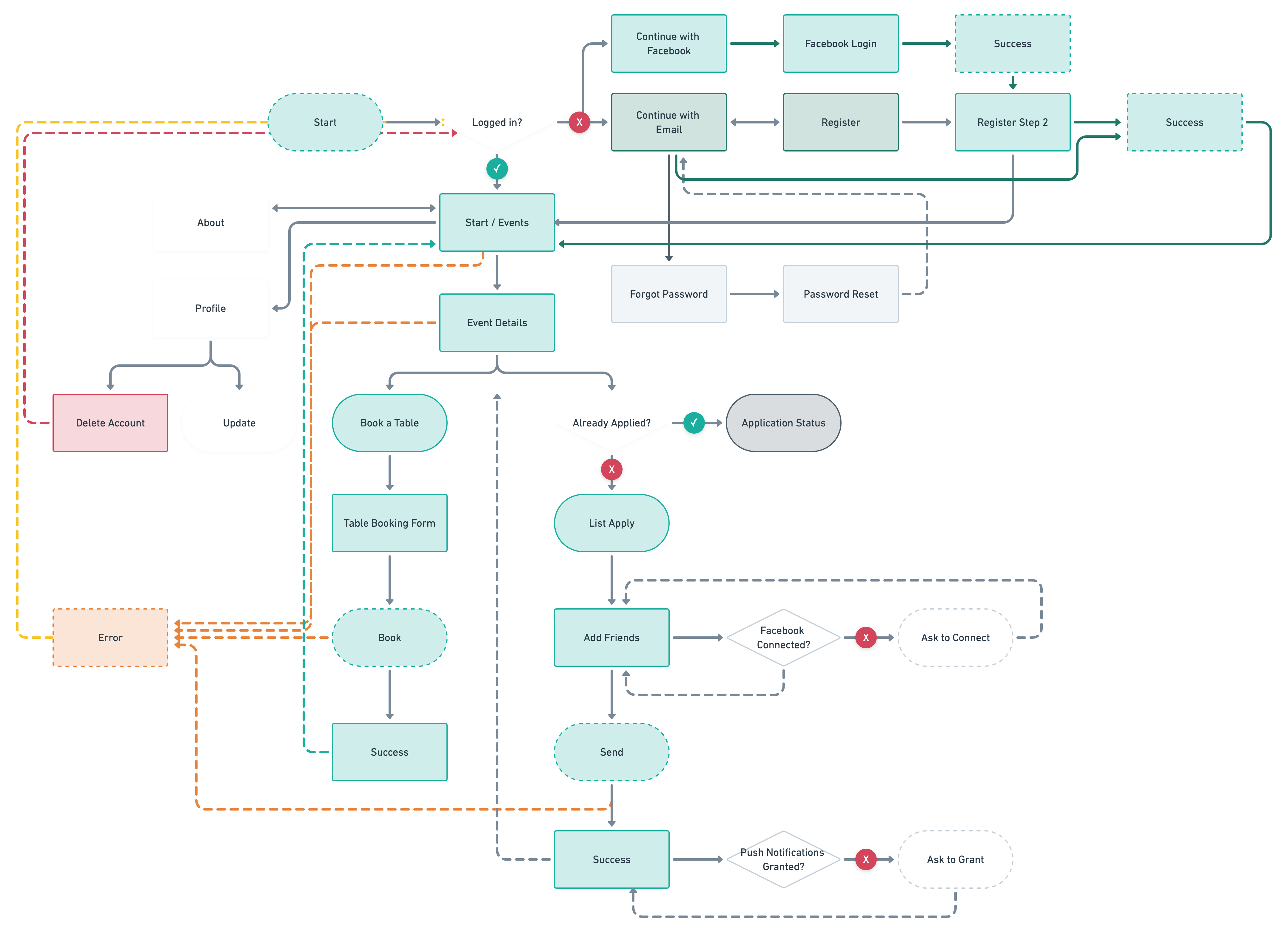
User flow
Visuals
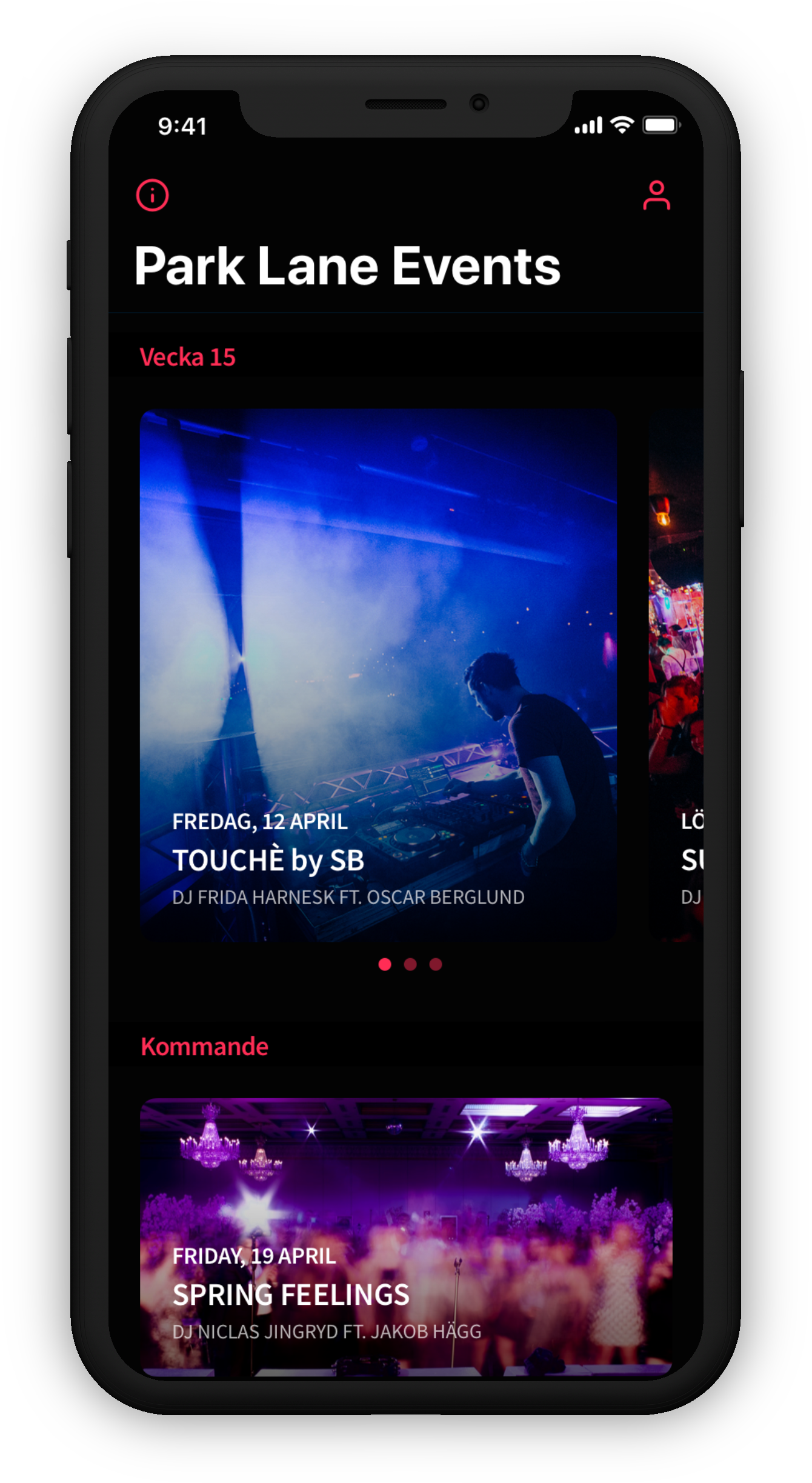
List of upcoming events. There are usually 3 events each weekend, and those are displayed on top.
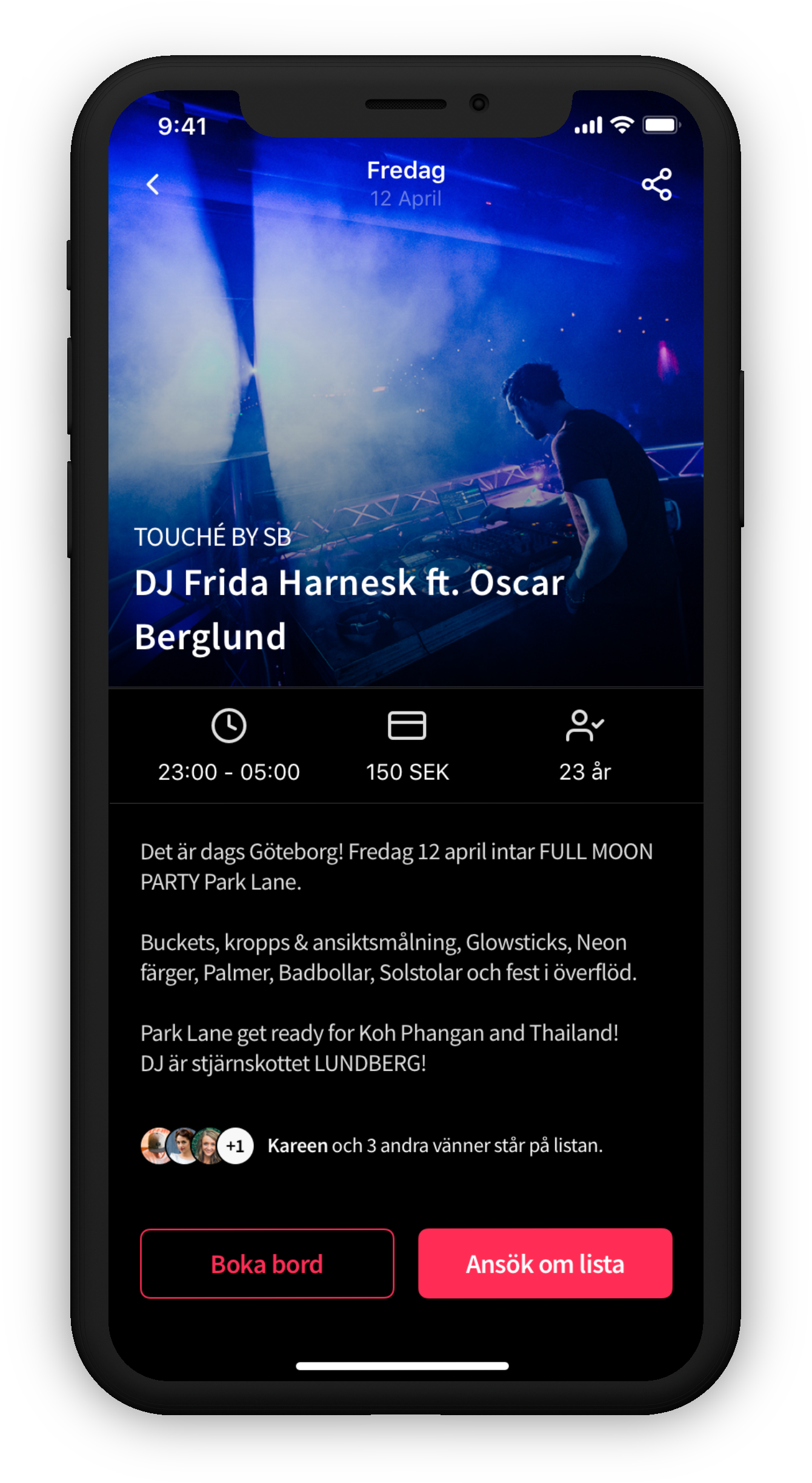
Event details and call to actions. The guest can book a table (secondary action) and/or apply to get on the list (primary action).
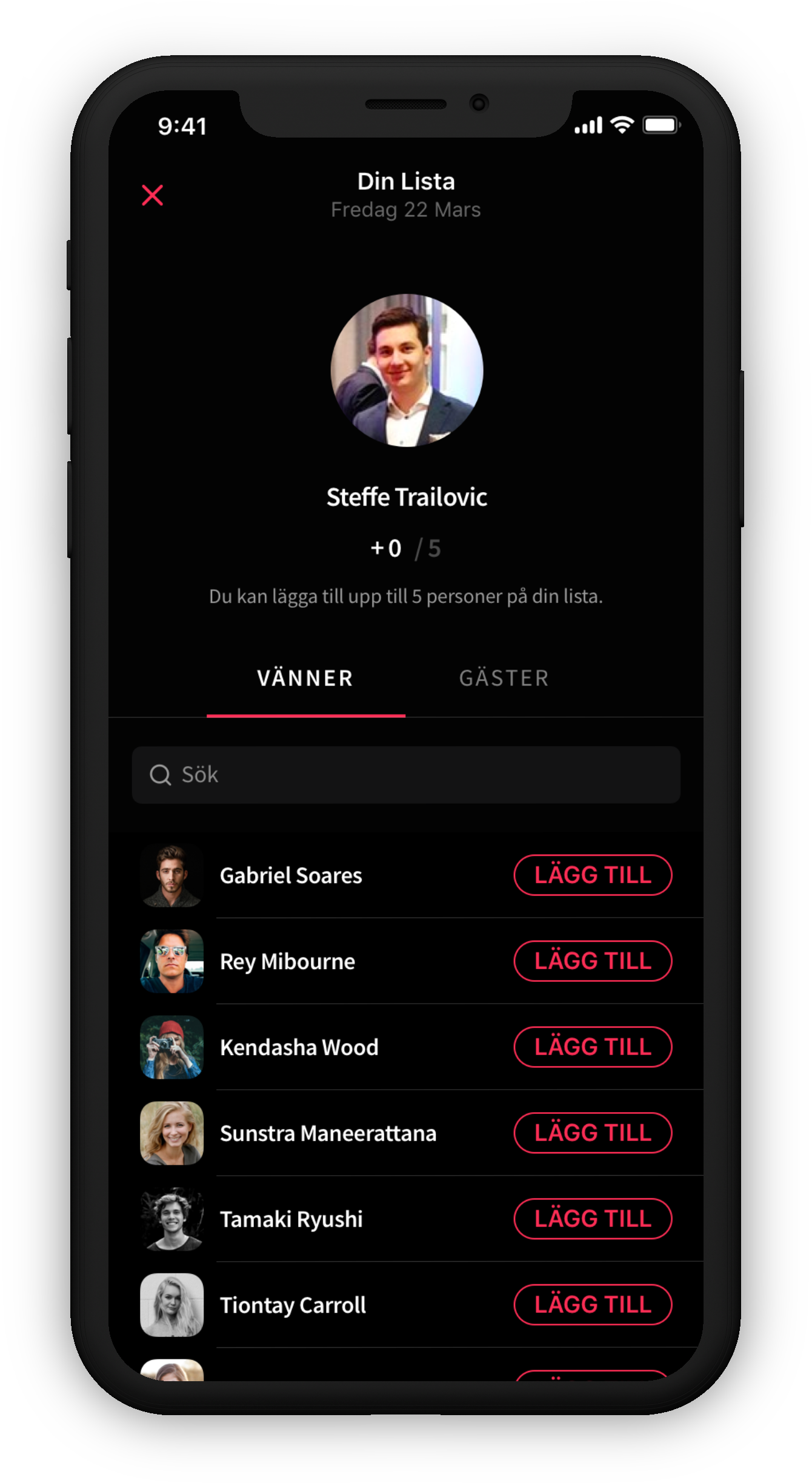
While applying for the list, guests can also invite their friends to be on the list with them. This way, the user is added on the list with "Name + X."
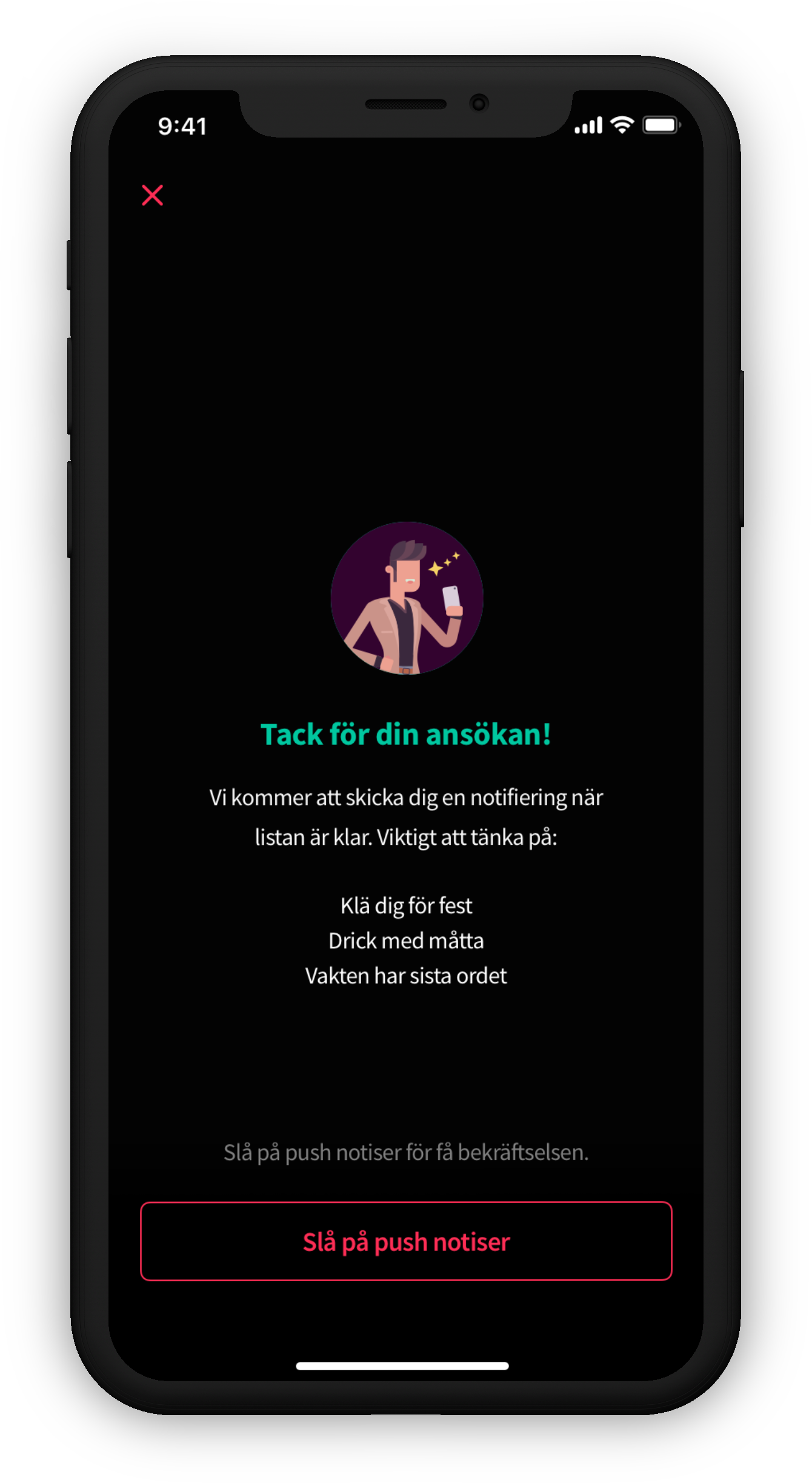
When the club managers approve (or denies) the guest to be on the list, a notification is sent to the user(s) confirming their status and terms.
Outcome
It’s important to remember that an app like this isn’t the main event – it’s a tool to enhance the customer’s experience with the club.
Our users, primarily young people on the go, aren’t looking to spend lots of time in a nightclub app; they just want to accomplish a few key tasks quickly. The goal for the Park Lane app was simple:
- 1. See upcoming events – Browse what’s happening at the club each week.
- 2. Join the list or book a table – Submit a VIP list request (and optionally reserve a table) in a couple of taps.
- 3. Get notified of status changes – Receive a confirmation if you’re accepted to the list (or a polite update if not).
And that’s all. We intentionally kept the feature set focused and straightforward – no gimmicky gamification, no endless image galleries. By not trying to compete with social media for attention, the app delivers exactly what the user and the club need: a quick, simple way to handle guest list logistics. (We did suggest a digital membership card feature to replace physical VIP cards – it could have saved the club printing costs – but the club chose to stick with the tangible cards as part of their branding strategy.)
In the end, Park Lane was very satisfied with the result. We delivered a solution that significantly improved their VIP list management and fit seamlessly into the club’s operations. Guests loved the convenience of the app, and the staff appreciated regaining control over the once chaotic process. The club’s management now has a clear overview of their expected VIP guests each night, and promoters and bouncers have a reliable tool at the door. We were proud to build something that elevated the nightlife experience for everyone involved.
Key Learnings
Every project teaches us something, and our team reflected on a few important lessons from the Park Lane app:
Technology – Choose the right tools:
We built the app using React Native instead of separate native iOS and Android apps. This cross-platform approach saved us time and made the code easier to manage for both platforms. There were a few limitations in implementing custom UI animations, but overall it worked well and even made handling features like push notifications fun to explore.
Customer Collaboration – Educate and adapt:
Our client was not very experienced with tech projects – there were minimal specs initially, and they often requested last-minute changes without realizing the impact on timelines. We learned to be patient and focus on educating the client. For us, delivering a valuable product and keeping the client happy was more important than rigidly sticking to the original deadline or scope.
Project Management – Scope and focus:
The project began with almost no requirements besides “Can you make an app for our guests to sign up for lists by June?” – and a fixed budget and deadline. We essentially jumped in head-first. As new feature requests kept coming each week, we had to figure out details on the fly and frequently re-adjust. This taught us that saying “yes” to every idea is not sustainable. It’s crucial to set clear priorities (which would normally be the product owner’s job – a role we didn’t have in this case) to avoid scope creep and ensure the most important features are delivered well.
Process & Best Practices – Done is better than perfect:
With a tight budget and short timeline, we inevitably had to make compromises and shortcuts. In an ideal world you’d do extensive research and user testing, but sometimes you have to roll with a “good enough” solution and improve it over time. We reminded ourselves that product development is iterative – you can always refine later. However, since this turned out to be more of a one-off project rather than an ongoing product, we in hindsight wish we’d had the chance to do more user research up front. It was a lesson in balancing pragmatism with ideal process: sometimes speed is essential, but you should loop back and polish whenever you get the opportunity.
Selected Works
Tillväxtverket - Kompass Design SystemDesign System
Stena Line - NemoAdmin Dashboard
Lighthouse Design SystemDesign System
MatchiWeb App
Zimpler - Mobile PaymentsResponsive Design
Zimpler - User PortalWeb App
QitchMobile App
GreenbyteWeb App Dashboard
Esab - WeldCloudWeb App

Butlr.net - The Help NetworkWeb App
Contact
If you’re looking to hire a product designer, I’d love to chat. I particularly enjoy working with small to medium-sized companies that have an excellent culture. Let’s connect!
