#00DDD4
Details
Overview
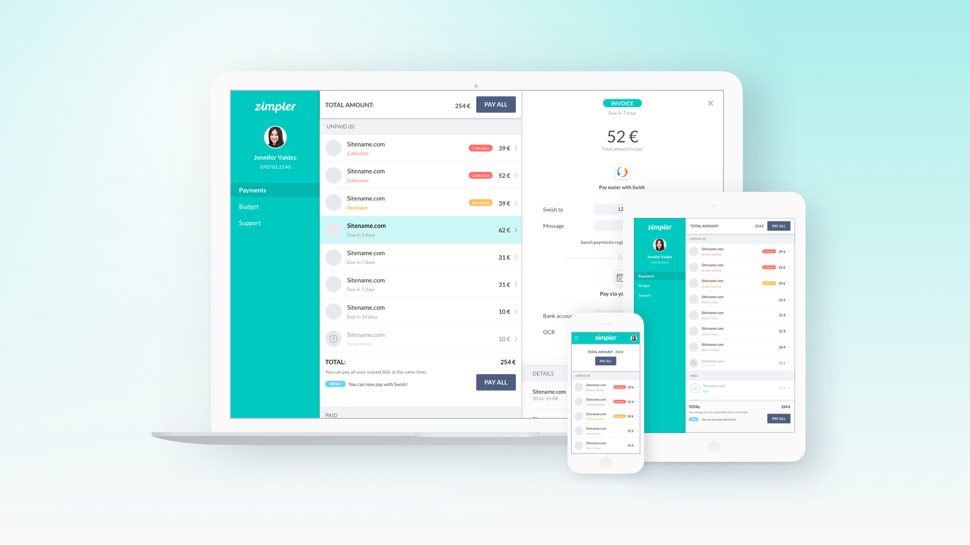
Zimpler is a fintech company that provides a smooth payment solution, particularly popular in the online gaming industry. The idea behind Zimpler’s service is to let users pay quickly via their mobile phones without the hassle of registration or passwords. I joined Zimpler as the sole UX/UI Designer at a time when the company was aiming to redesign their core mobile payment app (often referred to as the Zimpler Checkout) to make it truly mobile-first, fast, and secure. The goal was to increase conversion rates for payments by simplifying the user flow to the absolute essentials.
Goal
The project’s primary goal was to create a frictionless payment experience on mobile devices. Many online transactions lose customers at the payment step because of clunky forms or required sign-ups. Zimpler wanted to eliminate these pain points: no need to create an account or remember a password to pay – just use your phone and pay with minimal effort. The new checkout needed to be easy for first-time users while still secure and reliable. Additionally, it had to accommodate various payment methods (like paying by invoice, card payments, etc.) in a unified flow.
Challenges
User Onboarding: How do you identify and verify a user without a traditional login? The solution involved using the user’s mobile number and an SMS verification code (and in some cases Sweden’s BankID) to authenticate, but designing this in a way that felt seamless and quick was a challenge. We needed to assure users that it’s secure, but not burden them with extra steps.
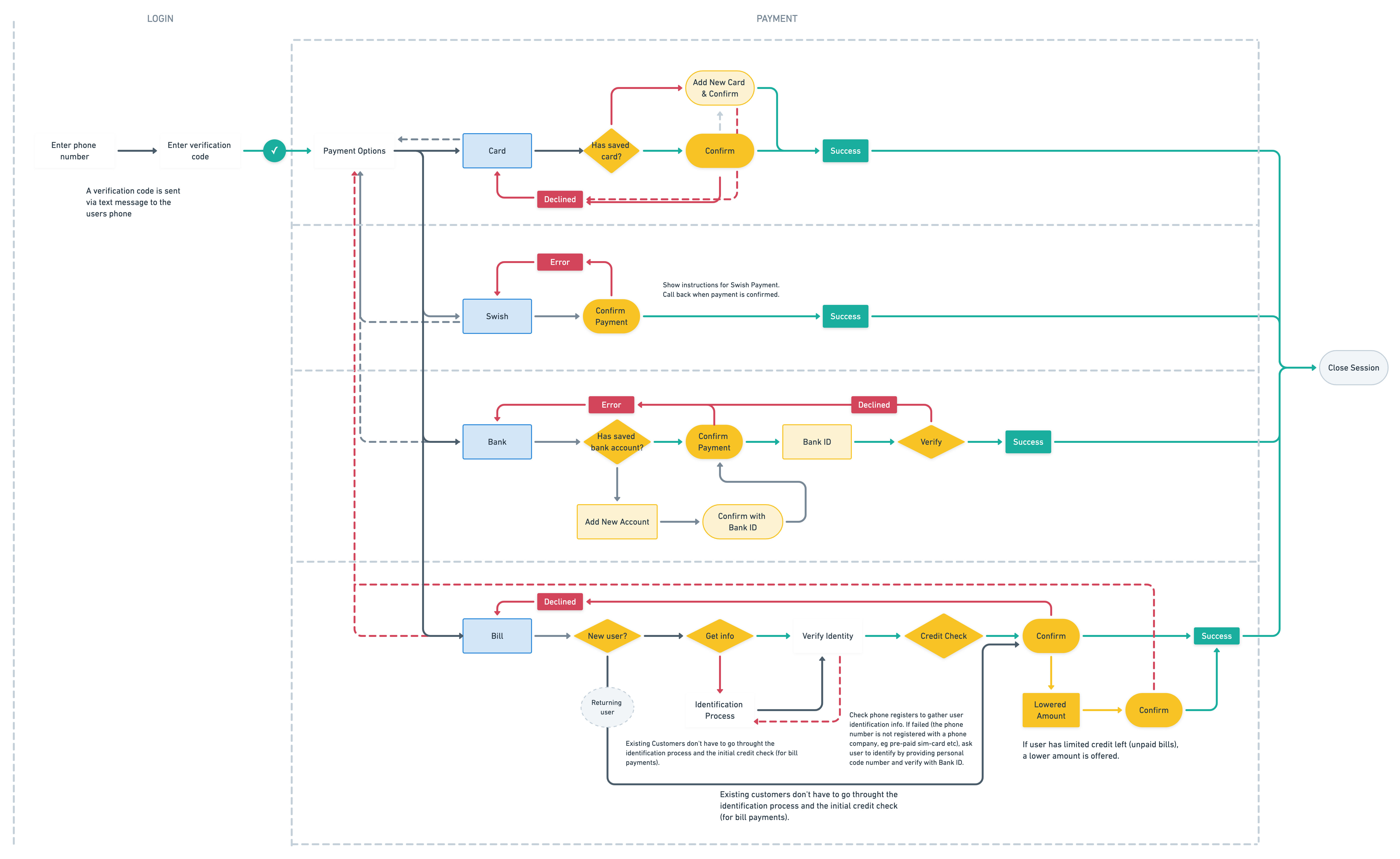
One-Flow-for-All: Since Zimpler’s clients (the merchants) could enable different payment options (invoice, card, bank transfer), the checkout flow had to handle multiple scenarios without feeling disjointed. Designing a flow that could branch into different payment methods yet still feel cohesive was tricky.
Mobile Constraints: On mobile screens, every pixel counts. We had to convey necessary information (like payment amount, merchant, and terms) and collect input (like phone number, card details, verification codes) in a very limited space. The UI had to be extremely clear, with large enough touch targets and an intuitive progression from one step to the next.
Trust and Security: As with any payment system, users might be wary of a new method. We needed to inspire trust through the design – using familiar patterns, reassuring messaging (“Secure payment via Zimpler”), and clear error handling if something went wrong (like a declined card). This also extends to visual design; for example, using the padlock icon or subtle cues that indicate security, and making sure the design aligned with Zimpler’s brand as a trustworthy financial service.
Solution
We crafted a mobile-first checkout flow that distills the payment down to a few simple steps. Here’s how the typical flow works that we designed:
Phone Number Entry: The user is prompted to enter their mobile phone number as the first step. This serves as the unique identifier – no username or account creation needed. The interface here is very straightforward, with a numeric keypad popping up and a clear explanation like “Enter your mobile number to receive a secure code.” For returning users, the system can recognize the number and greet them.
Verification (One-Time Code or BankID): Immediately after entering the number, the user receives an SMS with a verification code (or they’re prompted to complete a BankID authentication, which is a common secure method in Sweden). The app automatically detects the code if possible (to save the user from typing) or provides a simple input field. This step assures that the person using the phone number is the owner of that phone – a quick security check without making them remember any password.
Payment Details: Once verified, the user is presented with payment options. For example, Pay by Card or Pay by Invoice might be available depending on the merchant. We designed this screen to be concise: if paying by invoice (the original method Zimpler started with), the user basically just confirms they want to “buy now, pay later.” If paying by card, fields slide in for card number, expiration, and CVC. We used a lot of smart defaults and mobile-friendly inputs here – for instance, showing a numeric pad for card entry, auto-formatting the numbers into groups, and perhaps even allowing scanning of card details if possible. If other methods are available (say direct bank payment), those appear as clearly labeled buttons. The goal was that in just one or two taps after verification, the payment is confirmed.
Confirmation: After the user selects their method and confirms, we display a confirmation state – a friendly message like “Payment Successful!” with a checkmark, and details of the transaction (amount, merchant). If the payment was an invoice, it tells the user that an invoice has been created and what to expect next. If it was a card payment, it confirms the charge. We also prepared for edge cases: for example, if a payment is declined, the user sees an error message and suggestions (perhaps try a different card or payment method) in a clear, non-technical language.
User flow
Throughout this flow, the design remained minimalistic and focused. We used Zimpler’s branding colors and kept the interface clean: lots of white space, big easy-to-read text, and prominent buttons for the main actions. Each screen had a single primary action (Next, Verify, Pay, etc.) to guide the user step by step. We also included subtle visual cues; for instance, a progress indicator or simply a header that says “Step 2 of 3” to manage expectations on how many steps are left.
We paid special attention to microcopy – the little pieces of text that guide the user. Because we weren’t asking for a password, we added a line like “We’ll send you a one-time code to verify your phone” so users understood the process and felt secure about it. Error messages were made friendly: if an SMS code was wrong, it might say “Hmm, that code doesn’t match. Let’s try again.” rather than a scary red error.
I also contributed on the front-end side by working with developers to ensure the UI implementation matched the design. This included writing some of the HTML/CSS for the new forms and testing the flow on various devices (since on a slow network, for example, we wanted to ensure the loading states were handled gracefully).
Visuals
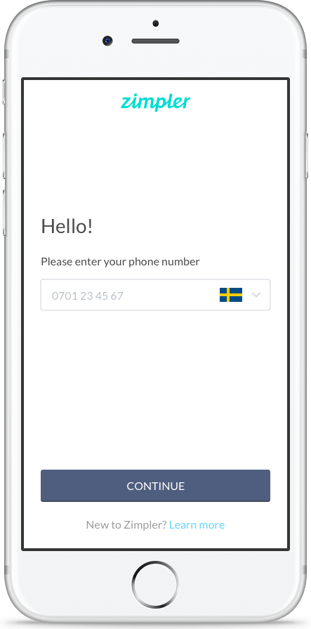
1. As soon as the checkout is launched, we ask for the phone number.
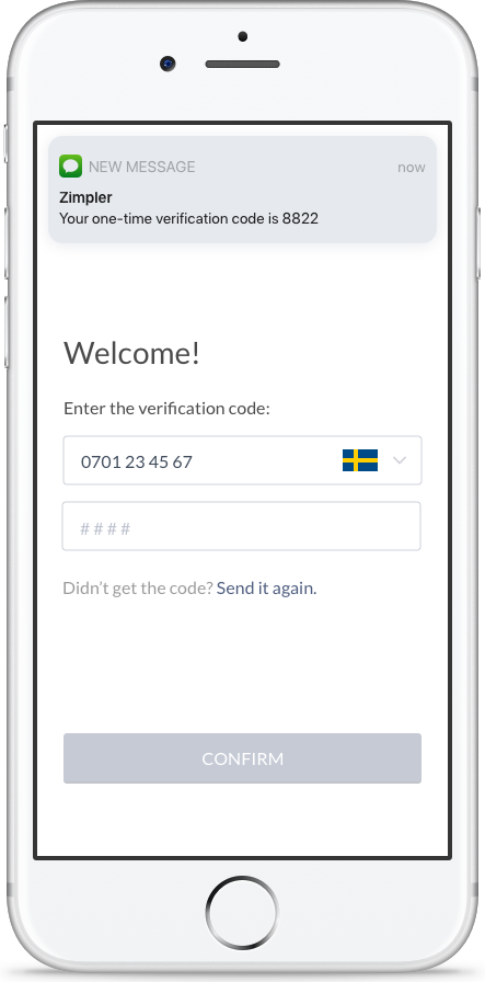
2. A verification code is sent and user enters this one-time code to verify and login.
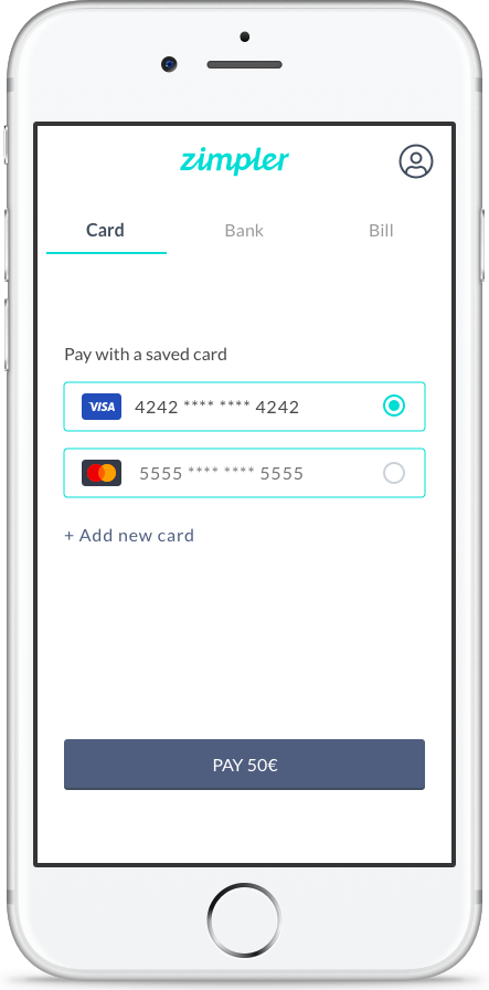
3. User choses the prefered payment method and cofirms payment. If card payment is chosen and there's a previously saved card - just press pay.
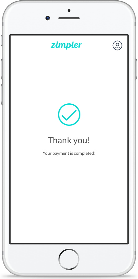
4. Confimation screen.
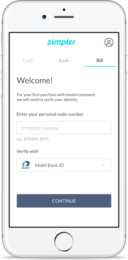
3. For the first purchase with invoice, the user needs to authenticate with BandID to verfy their identity.
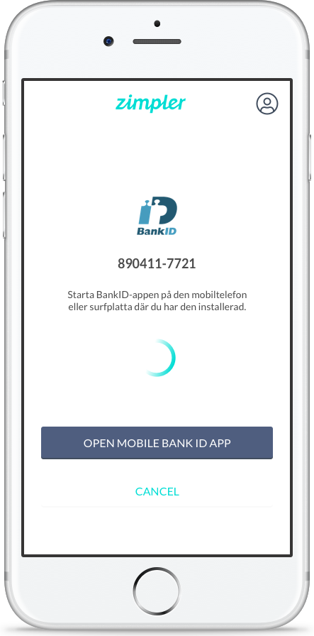
4. Authentication step.

5. One-click-payment.
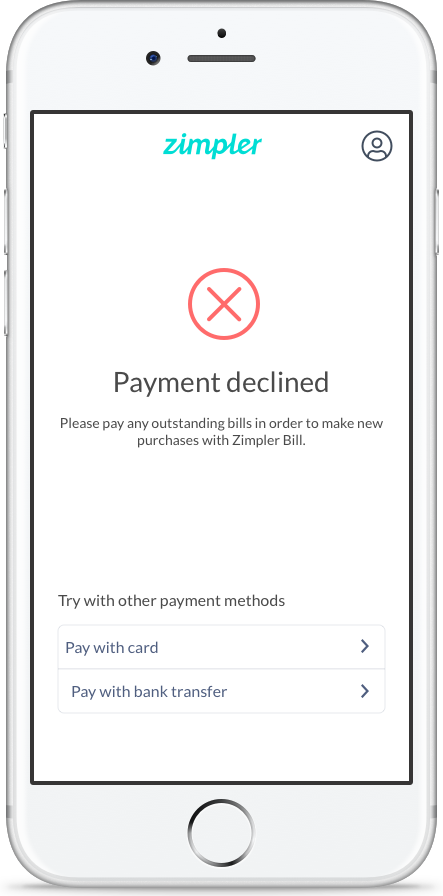
6. In rare cases, a user could have maxed out their credit and the invoice payment can not be approved. In those cases we suggest other payment methods.
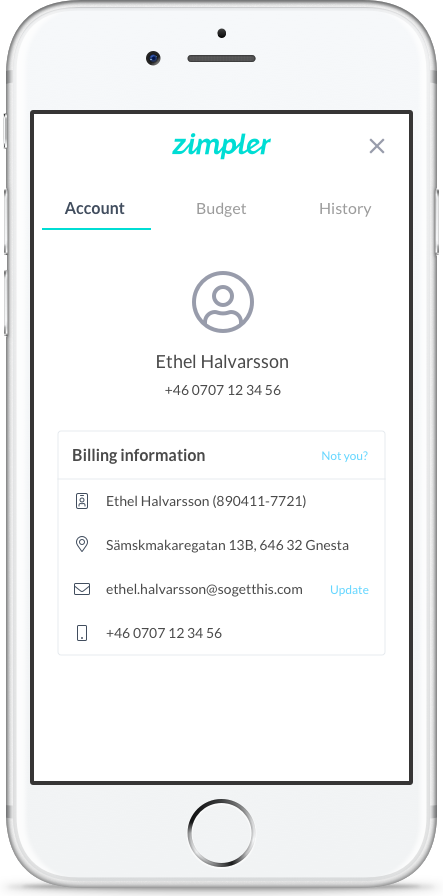
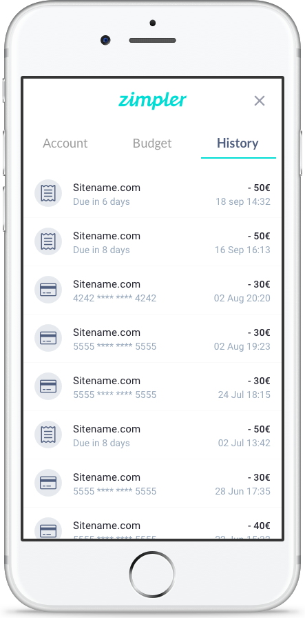
Account & History
We created a "profile" page for the uses with account information, payment history and budget settings.
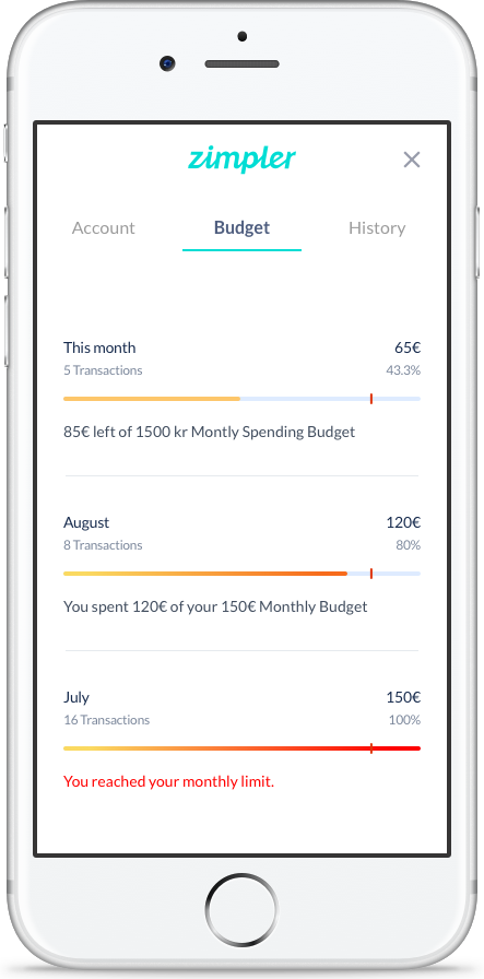
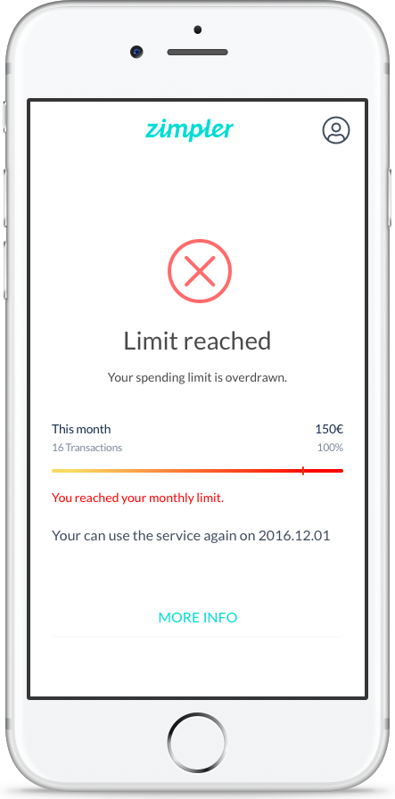
Budgets & Limits
In an attempt to make the credit scores and limits more transparent for the users, we added a budget section to display the budget and monthtly spent amount.
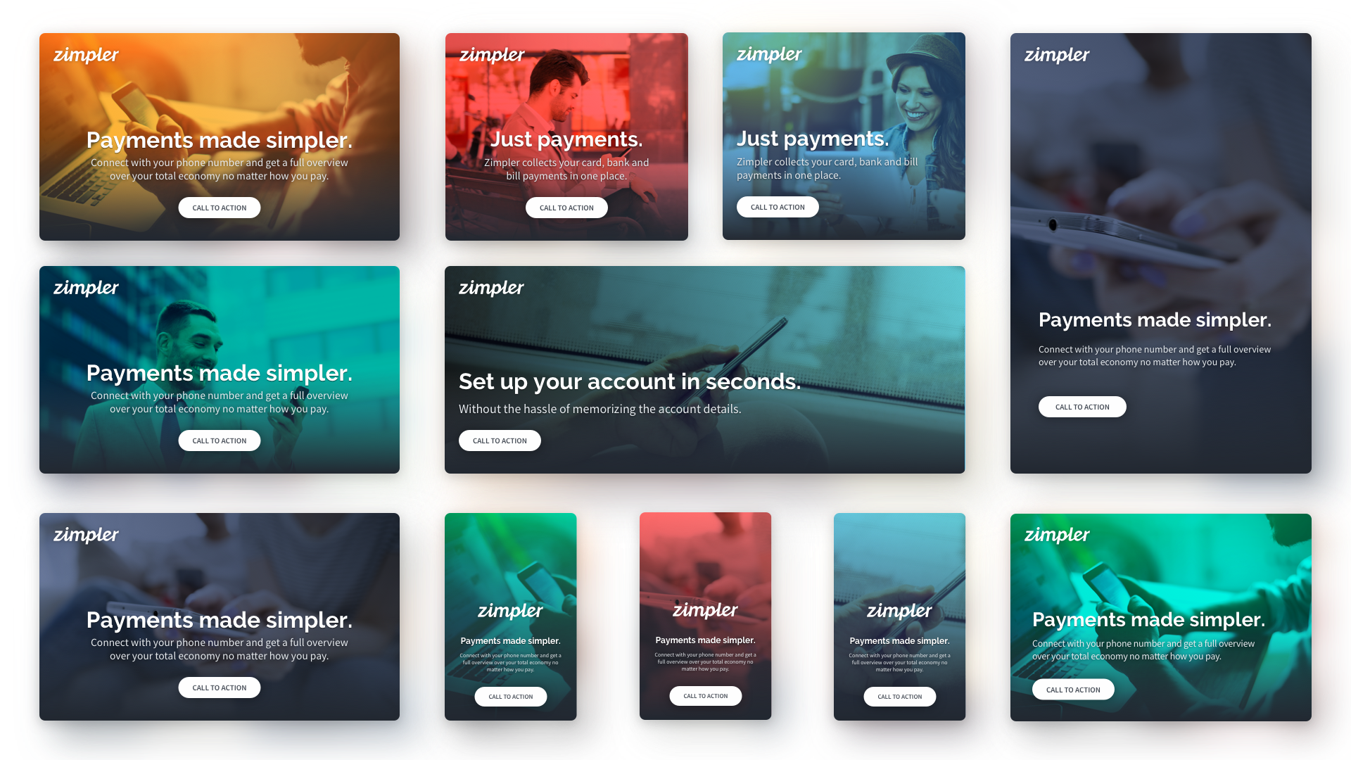
Branding & Marketing
As the only designer at the company I had many different roles and tasks; helping out the marketing department was one of them. I created the brand guidelines and produced marketing material.
Brand Colors
#4F5E7F
#63D5FF
#FDC66A
#FF7070
Gray Scale
#222831
#AAB2BD
#F3F7FA
Marketing Material
Result & Impact
The new Zimpler mobile checkout launched as a lightweight, fast payment option that many online merchants adopted. It significantly shortened the time and steps needed for a user to complete a payment compared to traditional methods.
For first-time users, the experience was novel: they could make a purchase with just their phone number and a code – no lengthy sign-ups. This reduced drop-off rates on the payment page; more people who started the payment process actually completed it. Returning users found it even more seamless, since Zimpler could remember their preferred payment method (for example, if they had completed an invoice or added a card before, it could be one tap to use it again).
The businesses using Zimpler saw higher conversion rates (i.e., fewer abandoned carts at checkout) thanks to this simplicity. Moreover, because Zimpler predominantly served the online gaming sector at the time, the typical user valued speed – they wanted to deposit money or pay for something in as few clicks as possible, and that’s exactly what the new design delivered.
From a design standpoint, we were happy with how the final product balanced security and ease of use. Sensitive steps like verification and payment info entry were handled in a user-friendly way that still met banking security standards. The interface was stripped of any unnecessary elements, which not only made it look clean and modern but also made it easier to maintain and adapt for future needs.
Additionally, our work on the mobile checkout laid the groundwork for Zimpler’s broader product ecosystem. Because I was also involved in designing their user portal (where users could later log in to see all their transactions – more on that in the next section), we ensured that the branding and style from the checkout carried over, providing a consistent experience.
Overall, this project was a great exercise in simplifying a critical workflow. It taught me that even processes that typically seem complex (like online payments) can be made incredibly simple if you challenge assumptions (e.g., “do we really need a password here?”) and focus relentlessly on the user’s perspective. The Zimpler checkout turned a traditionally cumbersome step into a quick, almost invisible part of the user journey – which is a big win for both users and the business.
Selected Works
Tillväxtverket - Kompass Design SystemDesign System
Park LaneMobile App
Stena Line - NemoAdmin Dashboard
Lighthouse Design SystemDesign System
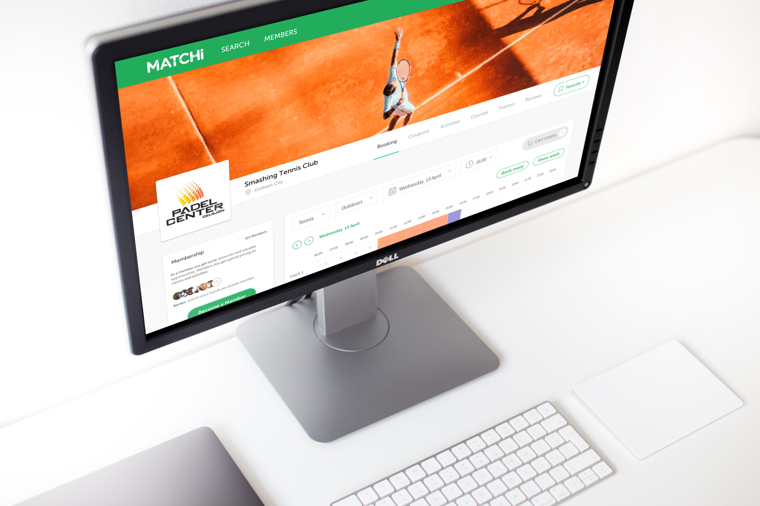
MatchiWeb App
Zimpler - User PortalWeb App
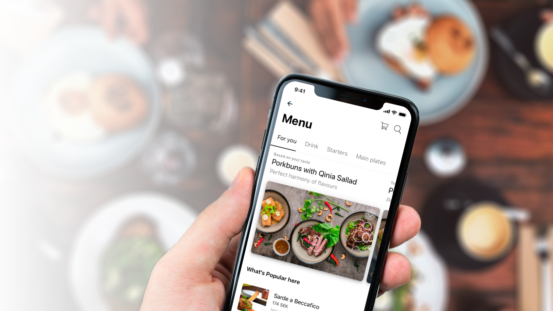
QitchMobile App
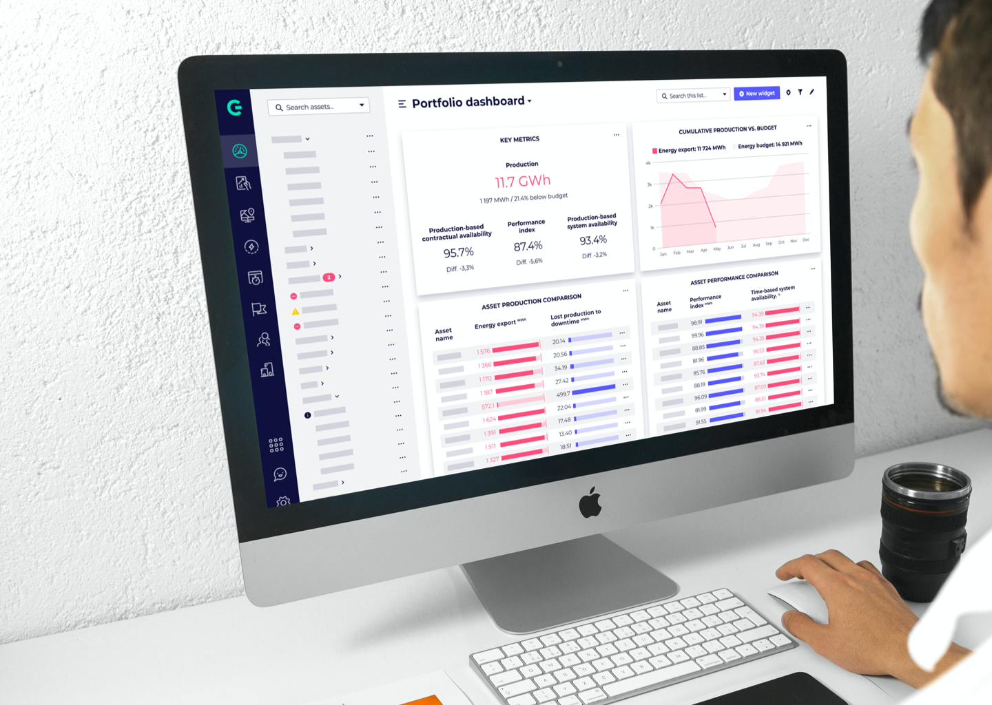
GreenbyteWeb App Dashboard
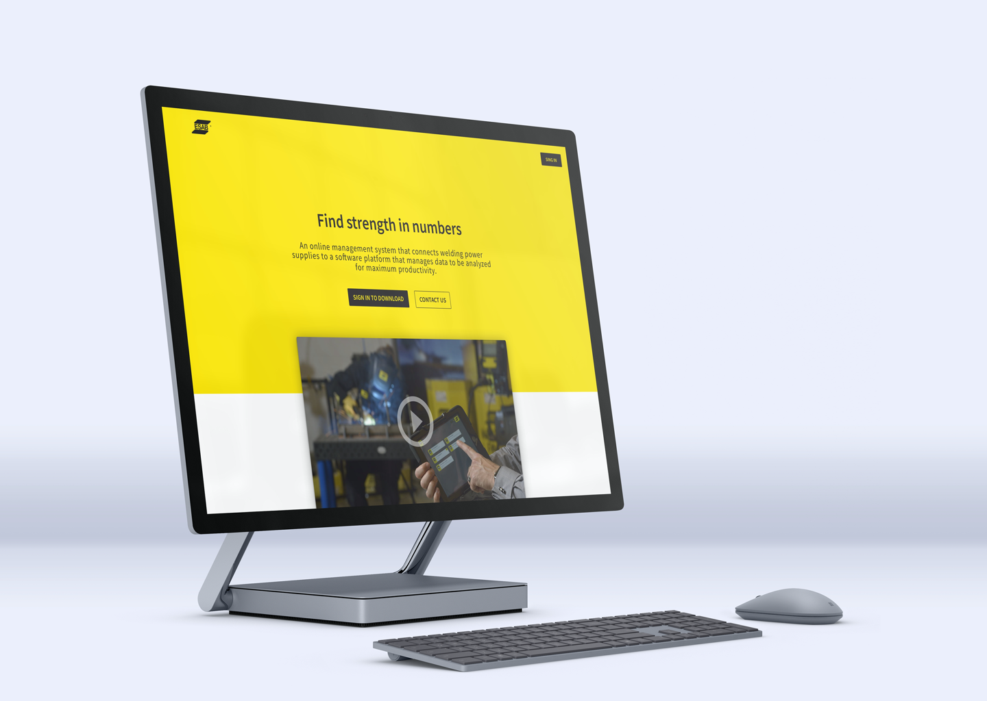
Esab - WeldCloudWeb App

Butlr.net - The Help NetworkWeb App
Contact
If you’re looking to hire a product designer, I’d love to chat. I particularly enjoy working with small to medium-sized companies that have an excellent culture. Let’s connect!