Overview
Qitch is a concept project I undertook to improve the experience of dining out at restaurants. It consists of a pair of apps: one for customers and one for restaurant staff. The idea behind Qitch was to digitize and streamline the restaurant service – from viewing the menu and placing orders to paying the bill – all through a smartphone, with the goal of eliminating the common pain points of dining out. This was a self-initiated project, meaning we weren’t hired by a restaurant but rather created the concept proactively, seeing a gap in the market. I led the UX and UI design for both the customer-facing app and the staff app, essentially acting as the product designer for this entire service.
Goal
The project’s goal was to make dining at a restaurant more enjoyable and efficient by leveraging a mobile app. In a perfect Qitch-powered restaurant, customers wouldn’t have to wait endlessly for service, and staff wouldn’t have to rush around so frantically – the app would help coordinate things. Specifically, Qitch aimed to:
- Let customers browse a restaurant’s menu on their phone (with rich descriptions and images), customize their orders, and send orders directly to the kitchen without waiting for a waiter.
- Enable customers to request service (like a water refill) or pay their bill whenever they’re ready, all from the app.
- Provide social and loyalty features, such as seeing friends’ reviews or earning rewards for frequent visits, to enhance engagement.
- Equip staff with a companion app to see incoming orders in real-time, manage table requests, and view customer profiles or preferences (for better personalized service).
In short, the goal was to remove the frustration from dining (no more flagging down waiters for every little thing) and make the experience smoother and more fun for both patrons and restaurant employees.
Challenges
Traditional Habits: Dining out is a very traditional experience and many restaurants still rely on paper menus and face-to-face communication. A big challenge was designing the app in a way that felt natural and non-intrusive to the dining experience. It should enhance, not distract or complicate.
Waiting Pain Points: We mapped out all the points where a customer waits: waiting to be seated, waiting for menus, waiting to order, waiting for food, waiting to pay… It was clear the problem wasn’t one single wait, but the accumulation of many small waits. Each of these needed a thoughtful solution in the app design. For example, how do we let a user flag that they’re ready to order without feeling awkward? Or how to prompt for payment in-app without seeming impolite?
Staff Workflow: On the staff side, integrating an app into their workflow could be challenging. Restaurants are fast-paced; if the app isn’t extremely intuitive, staff won’t use it under pressure. So the staff app UI had to be extremely clear, showing orders and table statuses at a glance. It also had to notify in real time (for new orders or requests) in a way that complements their existing systems.
Multi-Restaurant Use & Branding: Qitch was envisioned as a platform many restaurants could adopt. That means the design had to be somewhat neutral and flexible to each restaurant’s branding. Unlike a custom app for one restaurant, Qitch would contain many restaurants’ menus. The challenge was to allow each restaurant’s identity (their logo, their menu style) to shine through within the Qitch app template.
Social and Loyalty without Distraction: Adding social features (like seeing which friends have been to this restaurant or earning points for visits) is great for engagement, but we had to be careful not to detract from the core utility. The challenge was blending these features in so they enrich the experience if you want them, but don’t get in the way if you’re just hungry and want to order quickly.
Solution – Customer App
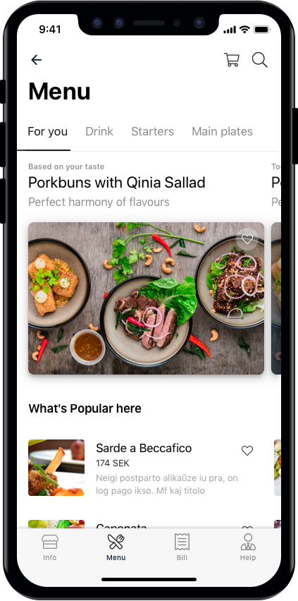
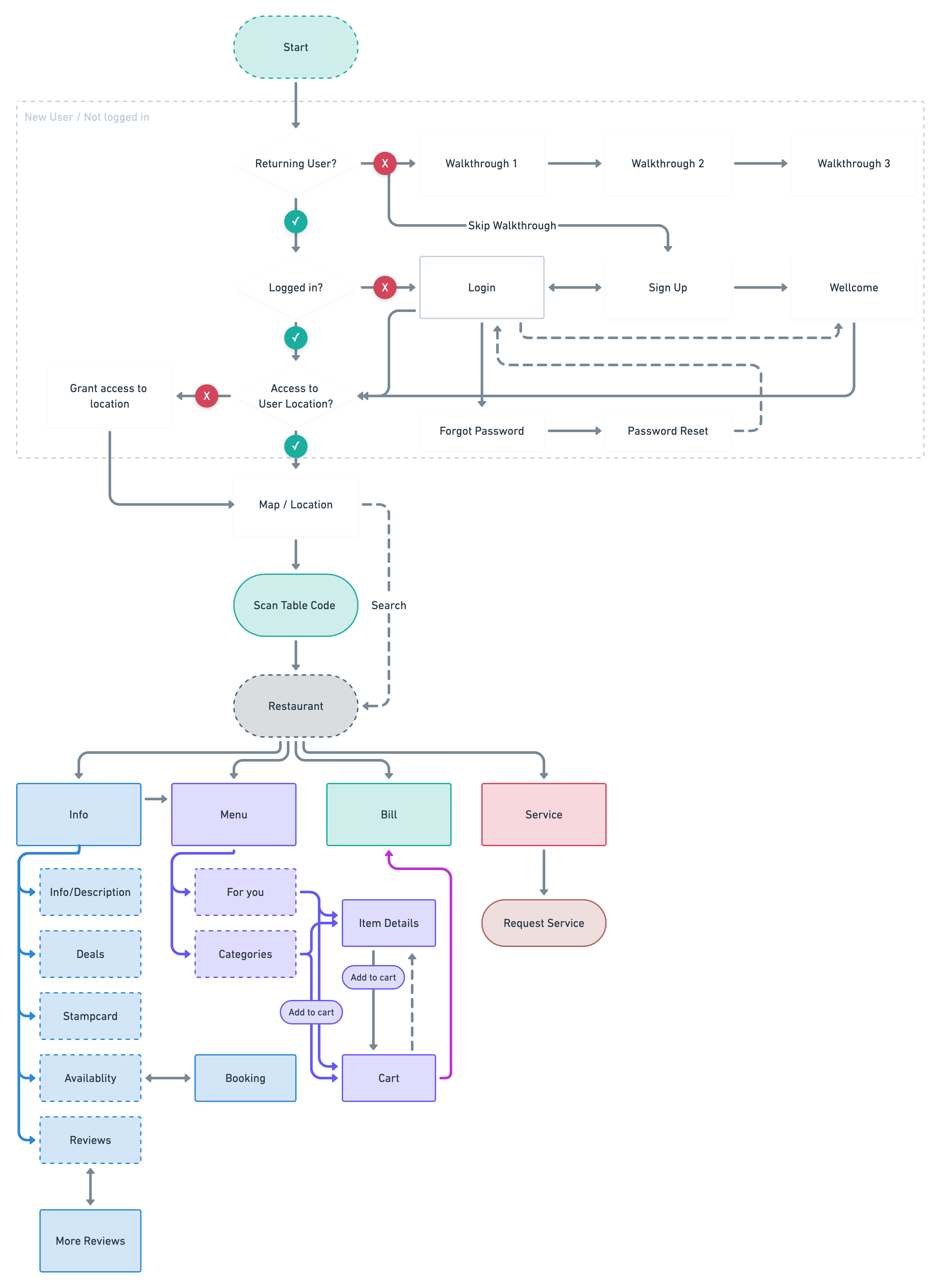
The Qitch customer app was designed to be the diner’s digital assistant at a restaurant. When a user opens the app at a participating restaurant, they can select the restaurant from a list (or scan a QR code on the table to automatically bring it up). Then they see the menu categories (starters, mains, drinks, etc.) with enticing photos and descriptions. They can tap to add items to their order (just like online food ordering apps). There’s an option to customize items (hold the mayo, extra spicy, etc.).
A key part of the design is that ordering through the app is at the user’s pace. No need to wait for the waiter to come over – when ready, the user hits “Place Order,” and the request is sent to the kitchen (via the staff app). The interface also shows expected wait times if available (“approx. 15 minutes for appetizers”).
While waiting, the app can entertain or inform: maybe show a progress update (“Your order is being prepared”) or highlight a loyalty perk (“You just earned 10 points – next dessert could be free!”). If the user needs something, there’s a “Call Server” or “Request Refill” button – essentially a way to ping the staff for assistance without waving your hand.
When the meal is done, the user can pull up their bill on the app. They can split it if they’re with friends (each using their phone to pay for what they ordered, or one person can pay for all). Payment is handled directly in the app (integrated with a payment system), so you don’t have to flag the waiter to bring the card machine. Once paid, the app might show a thank-you and perhaps ask for quick feedback or a rating for the experience.
Throughout the app, no more waiting is the theme. Want another beer? Order via app, it’s in your hands in minutes. Ready to go? Pay and leave, no idle waiting for the bill.
Solution – Staff App
The Qitch staff app works in tandem. It could run on a tablet at a waiter station or on handheld devices for waitstaff. When a customer places an order via Qitch, the staff app immediately shows the new order, with table number and details. It likely integrates with or mirrors to the kitchen’s order printer or display (this would be needed in a real deployment, though for the concept we assumed some integration).
The staff app also shows notifications: “Table 5 requested water refill” – that would prompt a waiter to attend to that table. It basically becomes a control center for service. Waitstaff can mark things as done (“Delivered drink to Table 5”) so everyone is in sync. The app also can show customer information: for instance, if a customer has a profile that notes “Vegetarian” or “Allergy: peanuts,” the staff sees that and can double-check any issues with their orders.
If the restaurant wants, they can also use the staff interface to manually input orders (for guests not using the app) so that all orders go through one system. That way, the kitchen queue is in one place whether orders came through Qitch or a traditional way.
One important aspect: I designed Qitch’s system to be opt-in and flexible. A customer who doesn’t want to use the app can still dine normally – the staff can serve them as usual. The app is there as an enhancement for those who prefer it, and staff would juggle both as needed.
Research methods
Information Architecture
Market research
Prototype testing
Persona
User Journey
Interviews
Design elements
Since Qitch was meant to be widely usable, I chose a neutral yet elegant design. The app’s default style uses a dark theme (a black or charcoal background with white text and bold accent colors for highlights) – this gives it a sleek, upscale feel that could fit in many restaurant environments (and has the practical benefit of being gentle on the eyes in a dimly lit restaurant). The accent color scheme was intentionally minimal so it wouldn’t clash with restaurants’ own branding; it served as a subtle frame for any restaurant’s content (like their logo or food photos).
The food photos really pop on the darker UI, making the menu engaging. We kept the UI controls (buttons, icons) fairly standard (to avoid any learning curve) but styled them to look modern. For example, a “Order” button might be a bright color but with rounded corners and maybe an icon of a shopping cart or plate.
I also ensured the typography was highly legible. Restaurant menus often have fancy fonts, but on a phone, clarity is key. I likely used a clean sans-serif font throughout. Any restaurant-specific font (like in their logo) could be shown in images or headers, but the dish names and descriptions would be in the app’s font for consistency and readability.
Brand Colors
System Colors
Gray Scale
User flow
Social & Loyalty Features
Qitch includes optional social features – such as connecting with friends to see where they’ve dined or to find popular dishes via a friend’s recommendation. In the app design, this might appear as a section like “Friends” or when viewing a restaurant, you might see “Your friend Alex dined here last week and recommends the Carbonara.” These are subtle touches that can influence choice but don’t interrupt the ordering flow.
There’s also a loyalty component: using Qitch at participating restaurants could earn you points or stamps. The app would track this, and in the profile section a user could see their rewards (e.g., “2 more visits to earn a free appetizer”). This encourages repeat usage and benefits the restaurants by driving loyalty. The design for this uses friendly badges and progress bars, making it feel almost game-like to collect points (which adds to the fun without detracting from the main utility).
Outcome & Reflections
Qitch was developed as a conceptual prototype and was positively received in preliminary user testing sessions. Diners loved the idea of not having to wait to pay or get service, and restaurant owners were intrigued by the possibility of increased table turnover (since quicker payments could mean faster seating of the next guests) and potentially being able to serve more customers with the same staff. The social/loyalty aspects were seen as icing on the cake – nice to have, especially for younger customers who enjoy sharing experiences and getting rewards.
Some key feedback and impact points:
- Reduced Wait Times: In simulations, a “Qitch” table could place orders faster and turn the table a bit sooner without feeling rushed. This suggests restaurants could see an efficiency boost.
- Staff Efficiency: Waiters reported that if such an app were implemented, it could free them up from routine tasks (like taking orders and handling payments) and allow them to focus on hospitality – greeting guests, making recommendations, etc. Essentially, it shifts their role slightly from order-taker to true host.
- User Empowerment: Users felt more in control of their dining experience. One tester mentioned how nice it would be to “just leave when I’m ready instead of trying to get the bill,” highlighting how that small change significantly improves the experience.
As a self-driven project, Qitch taught me a lot about end-to-end product design. I started from a personal pain point (“I hate waiting for the bill”) and expanded it to a full service design. I conducted user interviews with diners and restaurant staff to validate the problems and iterated on the prototypes based on their feedback.
It also was a crash course in designing for dual user groups (customers and staff) and ensuring the solution works for both – an important consideration because a great customer app means nothing if the restaurant can’t operationally support it.
We also had to think about branding and scalability: how to create something that can be adopted by many businesses without losing identity. By choosing a neutral design language and allowing restaurant-specific customization within set bounds, we struck that balance.
While Qitch in its entirety is still a concept (it would require significant development and integration to roll out in the real world), the exercise was immensely valuable. It sharpened my skills in experience flow design (covering an experience that spans digital and physical interactions), and it reinforced the importance of addressing both sides of a service equation (the consumer and the provider).
I’m confident that concepts from Qitch are harbingers of restaurant trends – indeed, since I conceived it, more and more restaurants have started using QR code menus and order-at-table apps. It’s rewarding to see the industry moving in this direction, validating the core ideas behind Qitch. And who knows, perhaps Qitch itself (or a similar service) will come to life and you’ll be able to order your dinner with it someday!
Selected Works
Tillväxtverket - Kompass Design SystemDesign System
Park LaneMobile App
Stena Line - NemoAdmin Dashboard
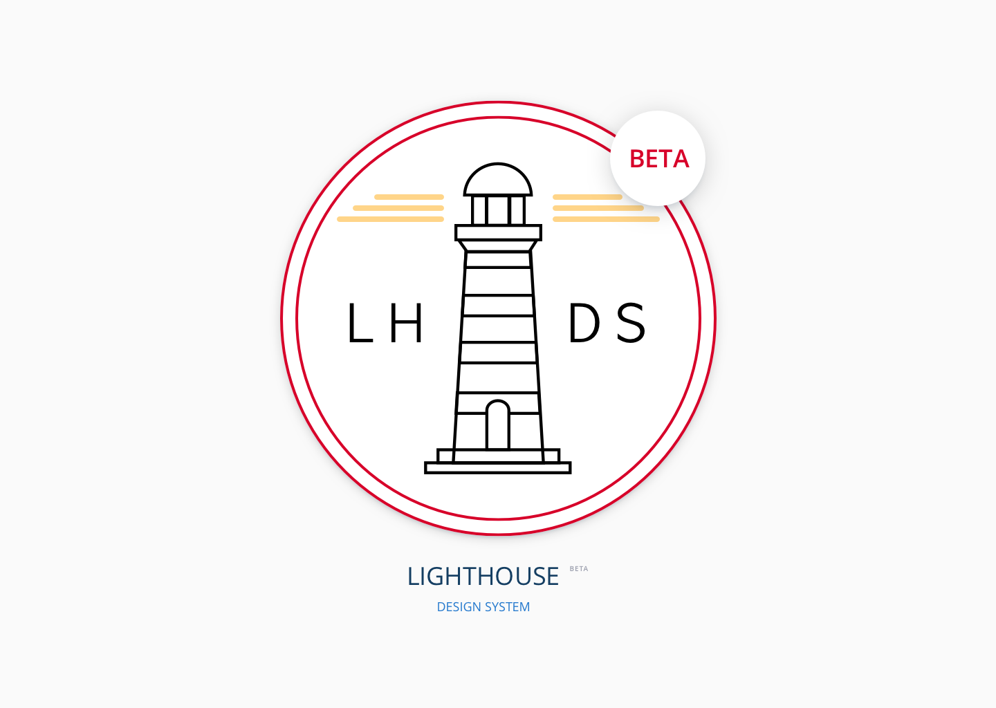
Lighthouse Design SystemDesign System
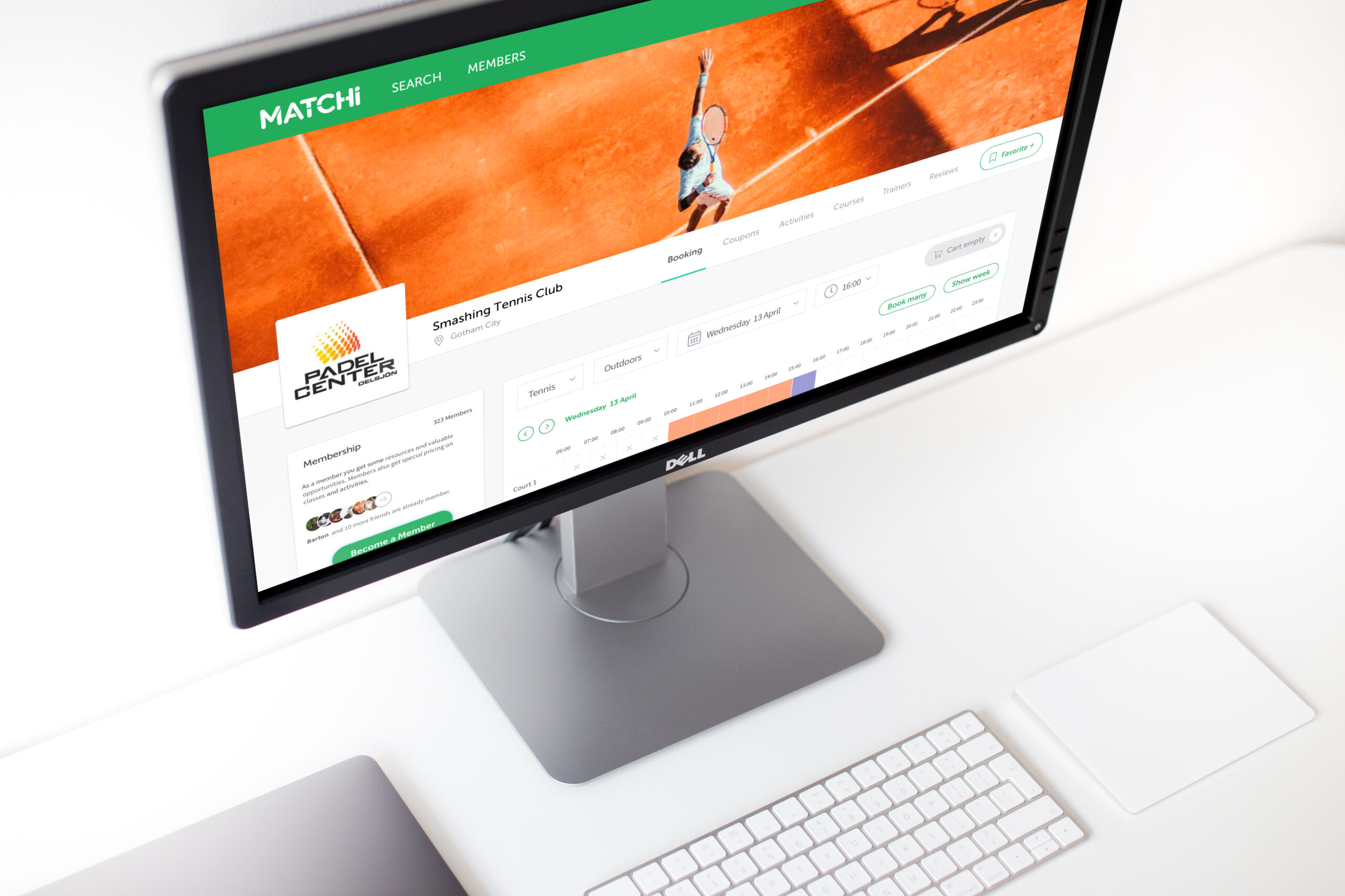
MatchiWeb App
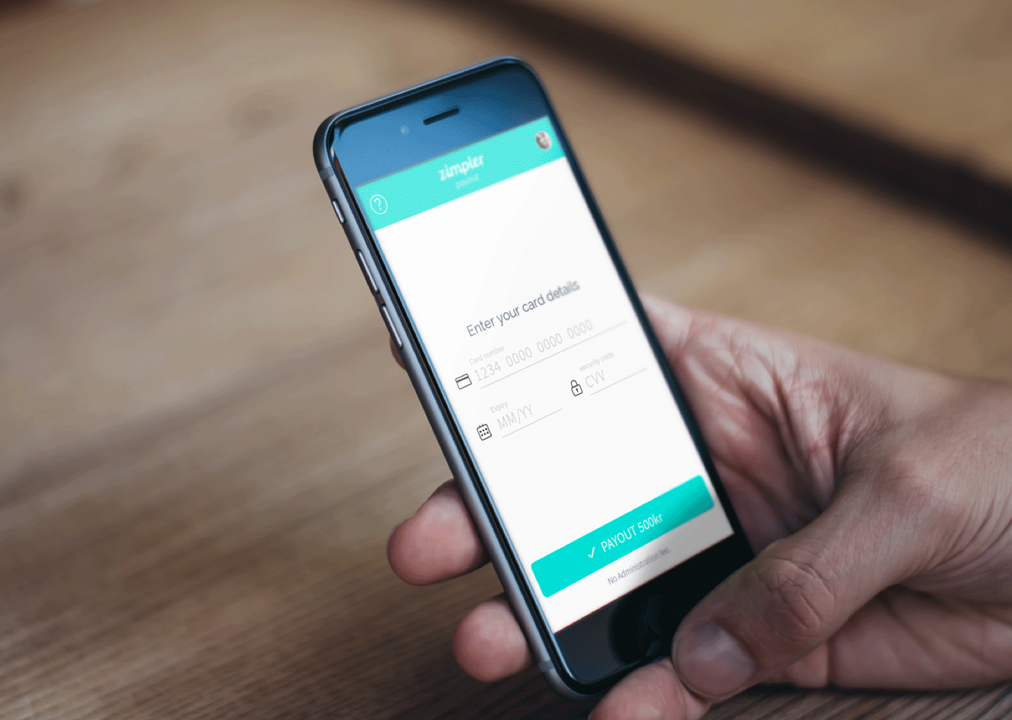
Zimpler - Mobile PaymentsResponsive Design
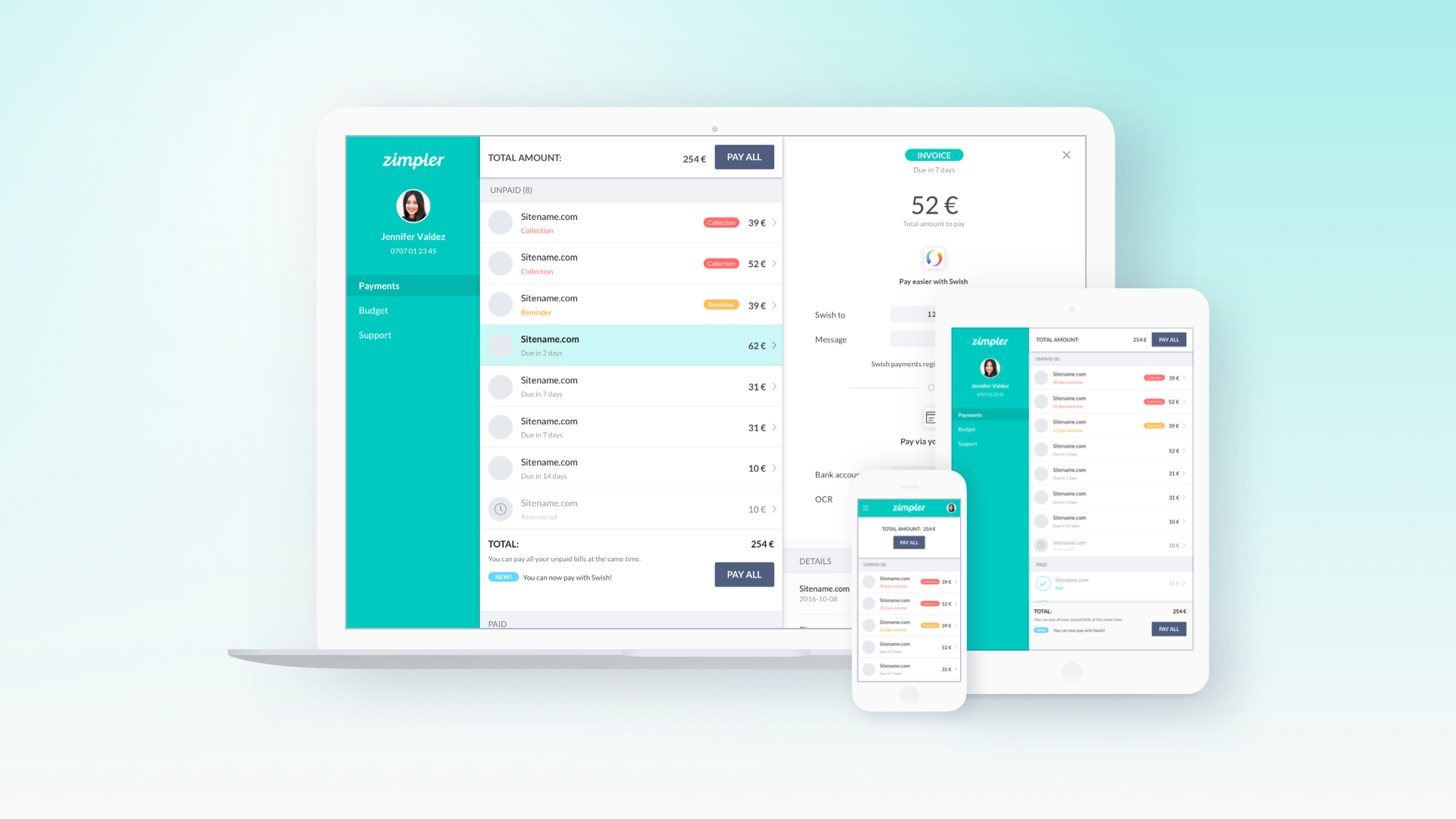
Zimpler - User PortalWeb App
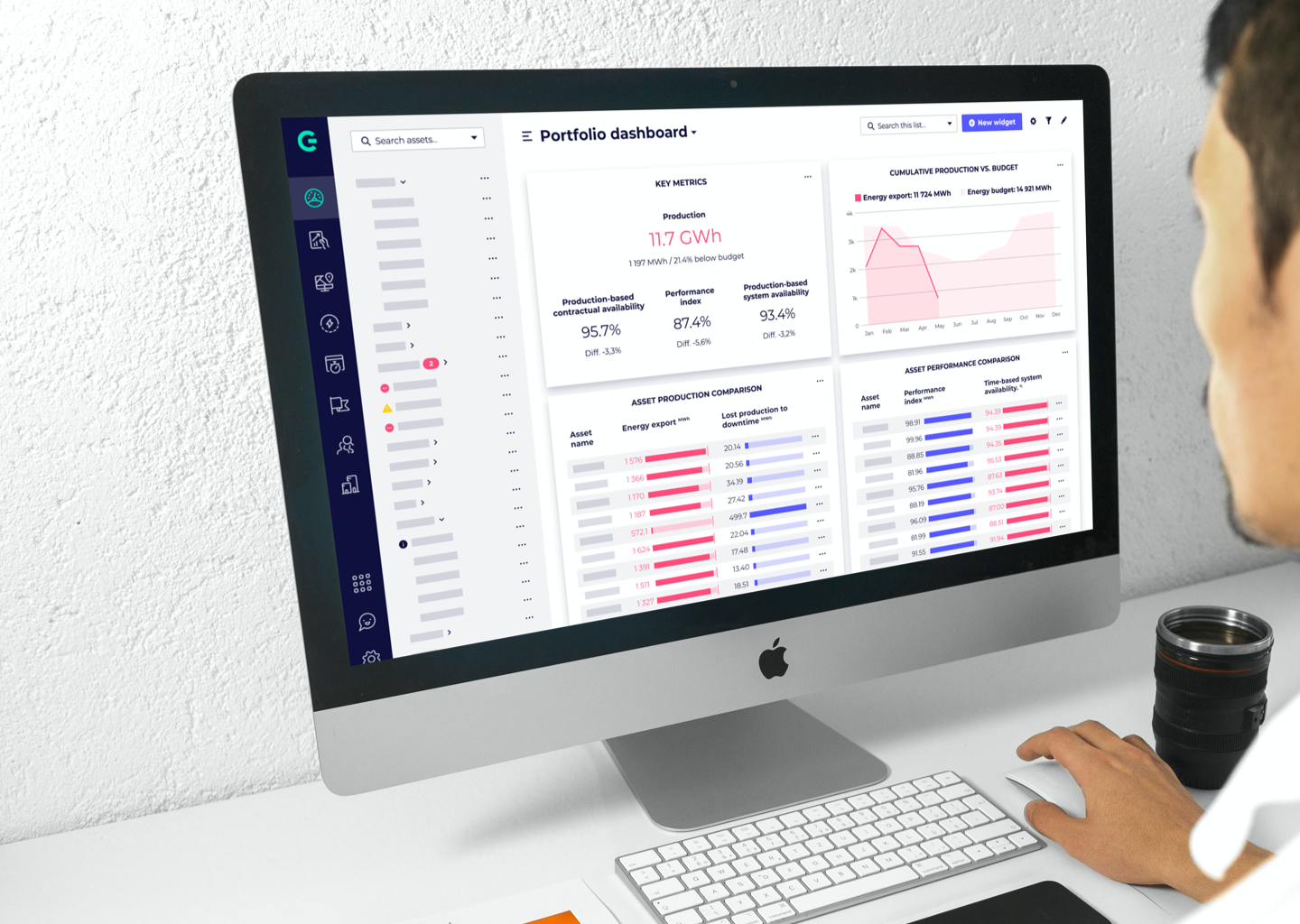
GreenbyteWeb App Dashboard
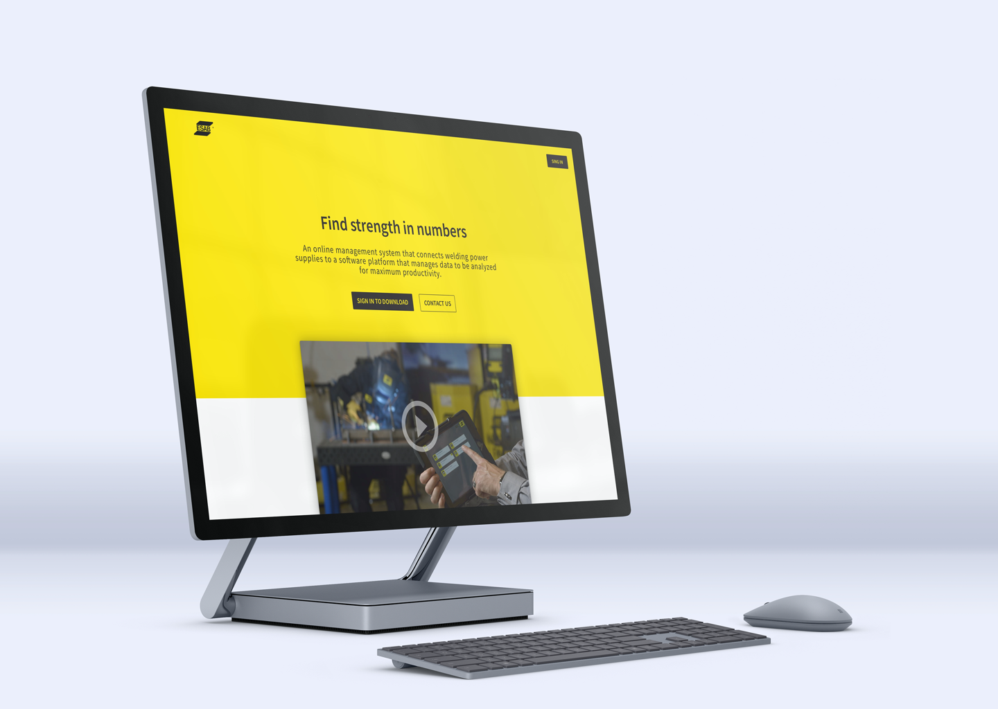
Esab - WeldCloudWeb App

Butlr.net - The Help NetworkWeb App
Contact
If you’re looking to hire a product designer, I’d love to chat. I particularly enjoy working with small to medium-sized companies that have an excellent culture. Let’s connect!