Overview
Stena Line, a large ferry operator, set a bold vision to become the world’s first cognitive ferry company. As part of a major digital transformation, I was brought on as UX Lead to help make this vision a reality.
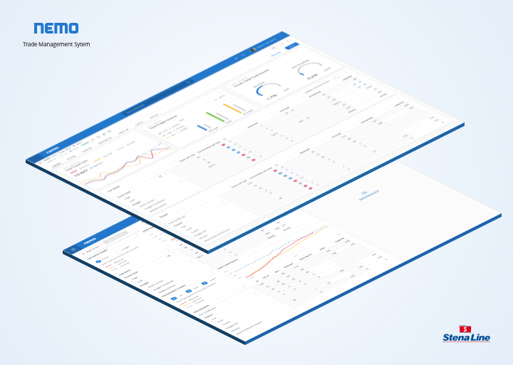
I joined the Trade Management team at Stena Line, where our primary mission was to develop an internal web application called Nemo. Nemo is an admin dashboard aimed at helping Stena Line optimize ferry departures – essentially a suite of tools to analyze and adjust capacity and pricing for ferry routes in real-time.
Challenge
Trade management for a ferry business is incredibly complex. Stena Line has over 28,000 departures annually and more than 1,000,000 price points just for passenger tickets. They rely on automation and efficient processes to maximize revenue and control costs for each sailing. Before Nemo, trade managers were juggling Excel sheets, PowerPoint reports, emails, and various legacy systems to do their jobs. There was no single unified view, making collaboration between departments (like Freight and Travel) difficult. The challenge was to provide trade managers with better digital tools – a way to see and adjust everything in one place – to improve decision-making and profitability.
Solution
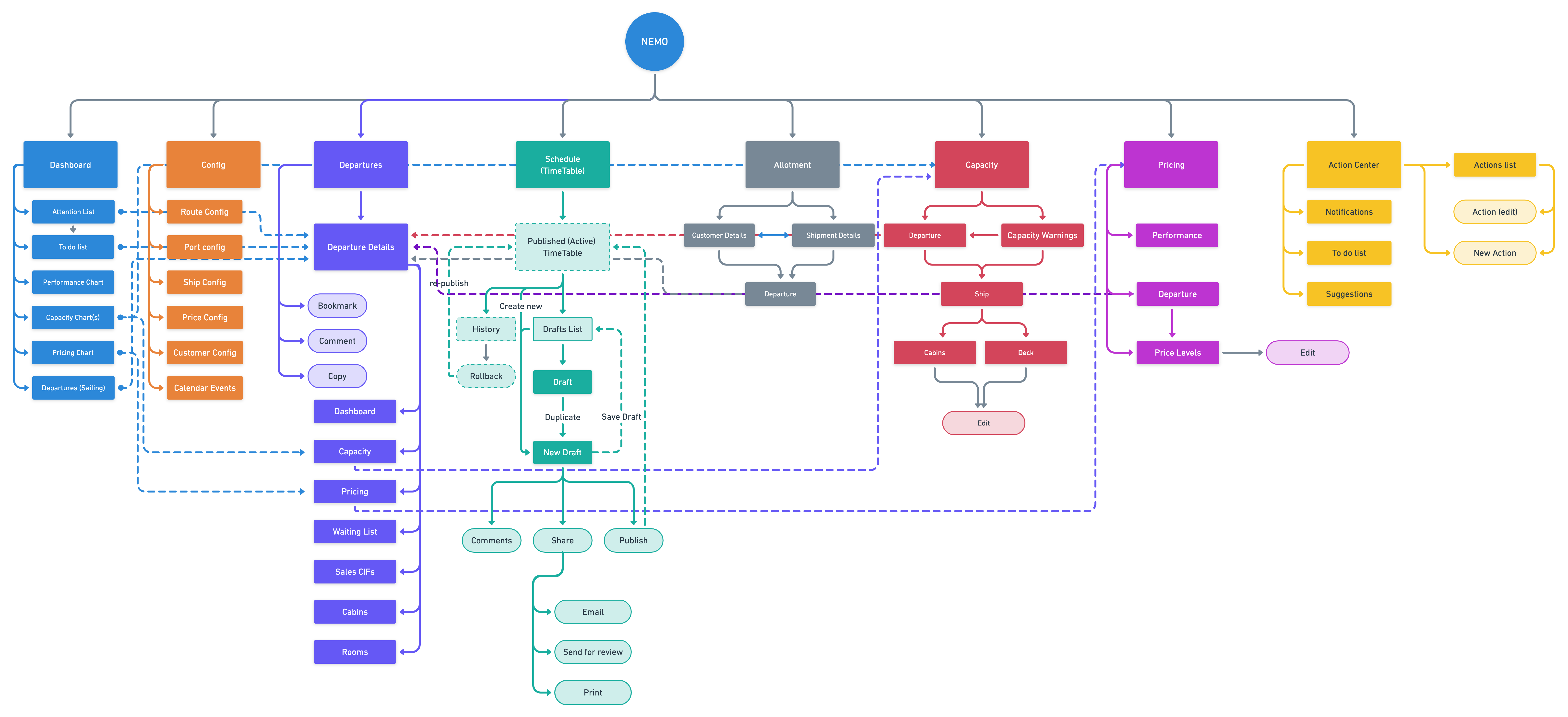
Stena Line’s answer was to develop Nemo, a cloud-based web application that would consolidate multiple tools under one roof. My role was to help design and build an intuitive interface for these tools and ensure they worked together seamlessly. Nemo ultimately comprised several key modules, each addressing a specific aspect of trade management:
- Timetable - Plan and manage ferry departure schedules and ship assignments.
- Customer Allotment - Handle block bookings efficiently (e.g., allocations of spots given to certain partners or large clients).
- Capacity - Provide an actionable shared view of available capacity for each departure, aligning the Freight and Travel departments on how space is utilized.
- Pricing - Enable dynamic pricing for travel tickets, so prices can adjust based on demand and other factors.
- Forecast - Show key metrics and automated forecasts for both travel and freight, helping managers make data-driven decisions to optimize each sailing.
All these components were integrated into the Nemo dashboard, giving trade managers a one-stop platform for monitoring and adjusting sailings. We used a variety of UX research and design methods throughout the project – information architecture planning, user interviews, personas, impact mapping workshops, and plenty of prototype testing – to make sure we understood the users’ needs and validated our solutions with them.
Research methods
Information Architecture
User interviews
Prototype testing
Persona
Impact Mapping
Users
The primary users of Nemo are Trade Managers and Trade Optimizers at Stena Line. Through research (including an Impact Mapping exercise), we identified four archetypes of users, each with different behaviors and needs, which helped guide our design:
The lookout
This user works tactically, keeping an eye on upcoming sailings weeks or months in advance. They need accurate forecasts and watch trends and KPIs to spot opportunities or issues early. Their pain point was not catching underperforming (or overbooked) sailings far enough ahead of time to react.
The operator
This persona is very operational, making real-time adjustments to optimize sailings. They solve capacity bottlenecks and negotiate space between freight and travel bookings daily. For example, they might adjust pricing levels or reallocate vehicle deck space. They have a big impact on profitability through these actions, but they struggle with knowing which action will have the best outcome – there’s uncertainty in deciding how to intervene for maximum profit.
The navigator
A strategic role responsible for the overall gross profit of a route. Navigators monitor performance against targets on a monthly and yearly basis. They ensure everything is in place for departures in the coming months and spend time fine-tuning the timetable. They also set base price levels for tickets (typically annually), which is time-consuming. Their frustration was a lack of visibility: they didn’t have a clear, detailed overview of current pricing and performance, which made it hard to confidently adjust strategy.
The concerned
This is someone (often in a supporting role) who constantly double-checks systems for errors – essentially trying to find mistakes before customers do. They’d rather focus on other tasks, but because they don’t fully trust the various systems’ outputs, they feel obligated to monitor for issues. This indicated to us that our solution needed to increase trust and transparency, reducing the need for this anxious oversight.
By understanding these user types, we tailored Nemo’s features to address their specific needs and pain points. For example, the Lookout got robust forecasting tools, the Operator got easy ways to tweak and see immediate effects, and so on.
User flow
Design and Consistency
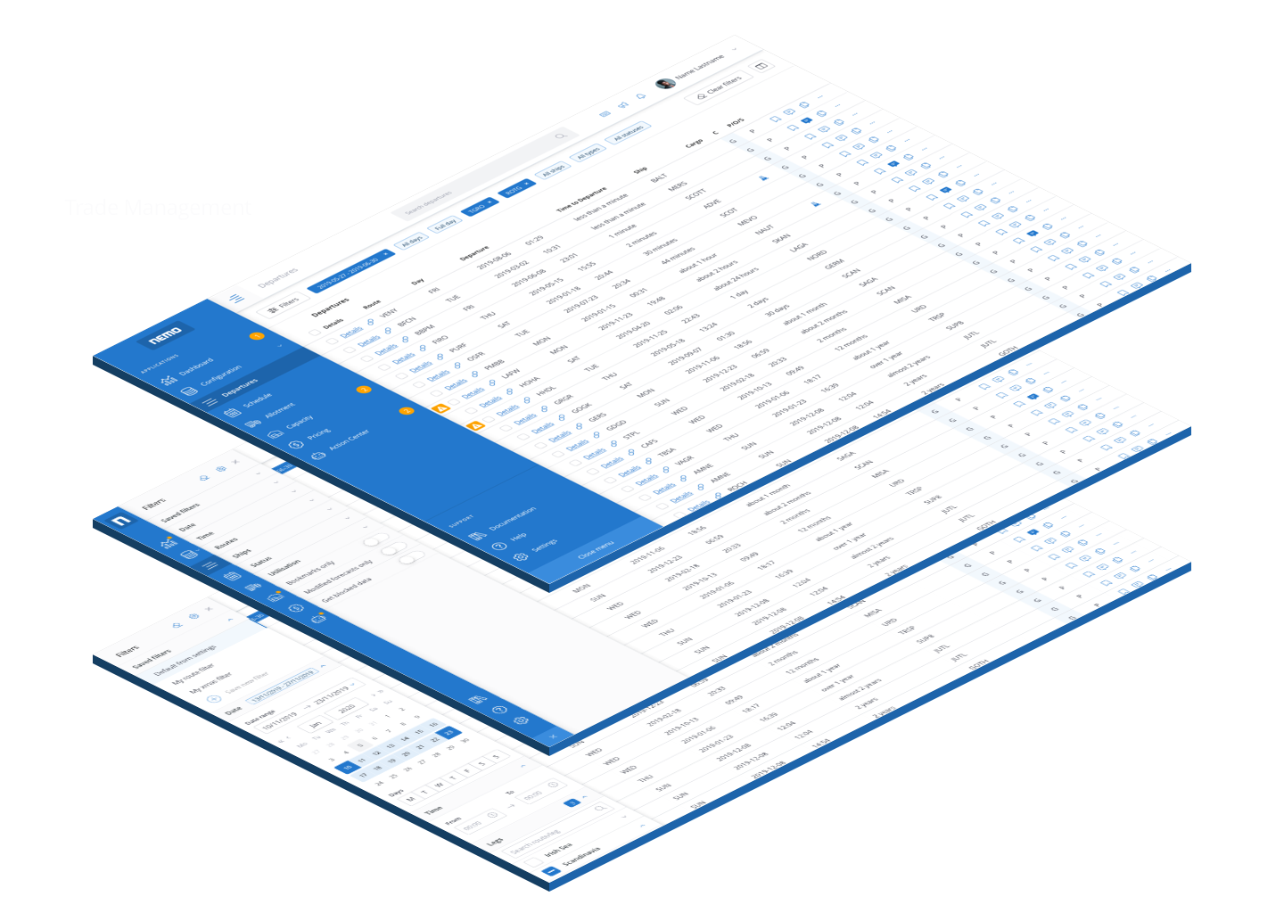
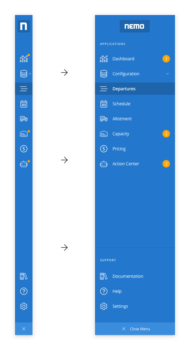
When I arrived, one big challenge (beyond the complex business logic) was UI consistency. Nemo had been worked on by at least three designers before me, each contributing bits and pieces, and there was a period where the team continued building features without any designer at all. The result was an inconsistent user experience – different parts of Nemo looked and behaved like entirely separate products. Moreover, other internal teams at Stena Line were creating their own tools with their own styles. There was no unified design language for Stena’s internal software, so using multiple internal apps was confusing: nothing felt cohesive or “on brand.” This raised an important question: How should a Stena Line internal application look and feel?
To solve this, we decided to create a design system from the ground up. By establishing a shared set of UI components, styles, and guidelines – essentially a common design language – we could bring order to the chaos. This effort became known as the Lighthouse Design System, which I planned and helped build alongside a small team of UX/UI designers and front-end developers. The design system provided a library of reusable components (with code snippets and usage guidelines) that all teams could use, ensuring consistency across products. In the long run, this would cut down on duplicate design work, speed up development (since teams could pull from pre-built components), and foster closer collaboration between designers and developers. We based Lighthouse on modular design principles and an 8-point grid for layout, making it scalable and easy to maintain.
(For more on this, see the separate Lighthouse Design System project below.)
With Lighthouse underway, we began applying it to Nemo. This meant redesigning parts of the interface to align with the new standard. We prioritized fixing the most jarring inconsistencies first. Over time, Nemo transformed from a patchwork of styles into a unified, modern dashboard.
Visual Design
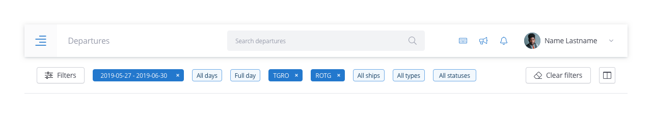
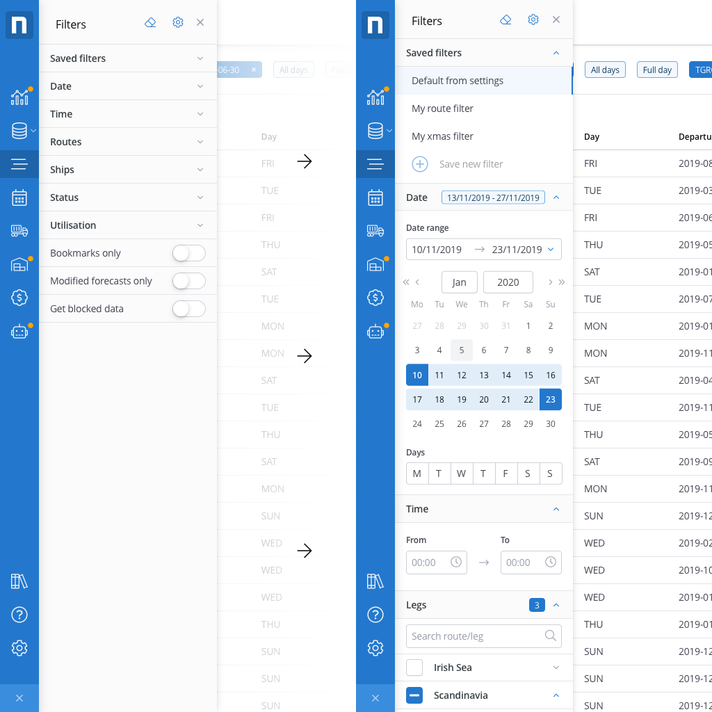
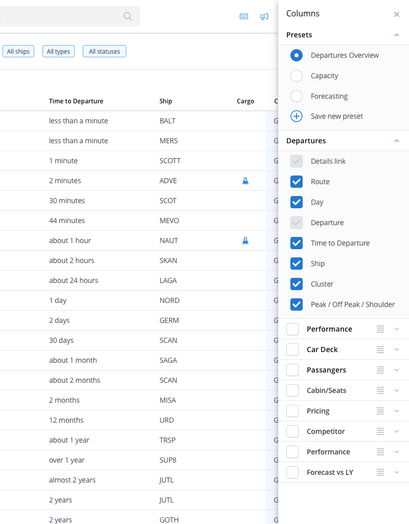
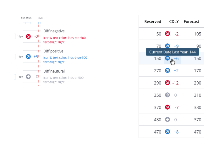
Nemo was a data-heavy application – lots of tables, forms, and numbers to display. As we designed new features (and translated very old system screens into the new web app), the key challenge was to make the interface cleaner and smarter without losing any important information. We simplified layouts, used clear typography and color highlights to draw attention to key data, and introduced filtering and drill-down options so users could navigate the information logically. For example, the Capacity view used visual cues to show when freight and travel allocations were imbalanced, and the Pricing module could highlight which sailings had unusually high or low prices compared to the norm. We constantly had to balance comprehensiveness (the users often needed a lot of data) with clarity (presenting it in an understandable way).
Prototyping & Iteration
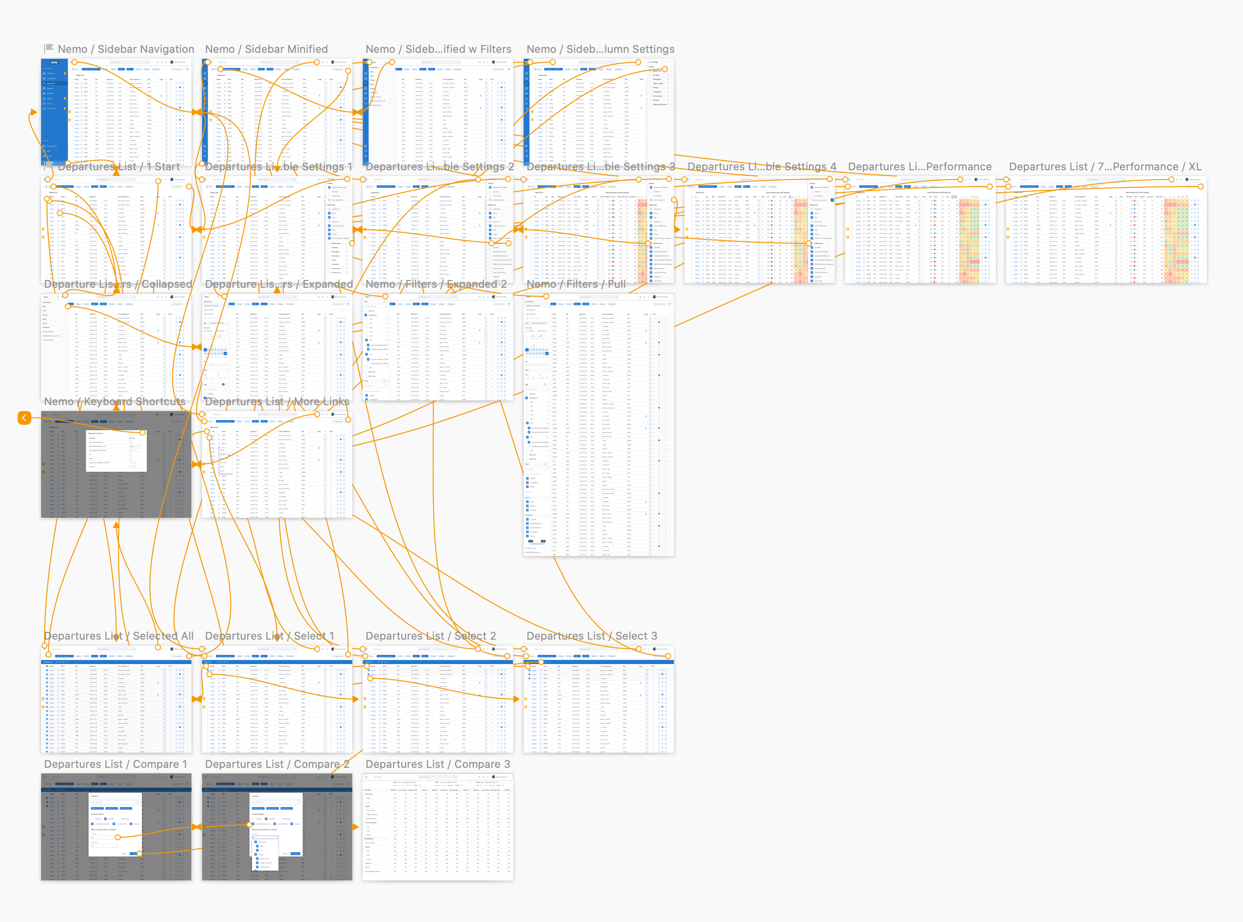
Given the complexity, we took a very iterative approach to building Nemo. I created interactive prototypes for virtually every major feature or change. Every two weeks, we held review meetings with users and stakeholders – essentially demoing the latest prototype. These sessions were invaluable: we gathered feedback, answered questions, and observed where things might be confusing or could be improved. If something wasn’t clear to a trade manager in a demo, we knew it needed refinement before development. Between these meetings, I sometimes recorded quick demo videos of new interactions or designs and shared them with users to get faster feedback, and I frequently sent out InVision prototypes that users could click through on their own.
This continuous feedback loop ensured we didn’t go down the wrong path and that by the time features were developed, they were already vetted by the people who would use them. We also collaborated closely with developers, especially on fine details like micro-interactions and animations. In some cases, it was faster to have a developer prototype an animation in code and tweak it together, rather than trying to perfectly simulate it in a design tool. This designer-developer teamwork made the end result feel much more polished.
Implementation & Agile Process
Building Nemo was truly a team effort, and it wasn’t a linear process. We were simultaneously implementing new features and refactoring old ones to use the design system. This could get chaotic: at one point, developers were adding brand-new functionality while also replacing chunks of legacy UI with Lighthouse components, and another team was improving the design system itself based on our feedback. To manage this, we adopted a “move fast and break things” mindset – but in a controlled way.
We would implement the new design system elements in a separate development branch or staging environment first, so as not to disrupt daily work. We’d test the updated UI thoroughly, note any issues (visual bugs, usability problems, etc.), and log them. Then we’d prioritize which fixes were critical before we merged changes into the main app.
By delivering and integrating changes in small chunks, we avoided a massive, risky overhaul all at once. Continuous delivery of improvements allowed us to gather feedback incrementally and ensure Nemo was always improving without ever going completely offline for a “big redesign.” Over time, this approach paid off: Nemo evolved into a far more cohesive product even as we kept adding new capabilities.
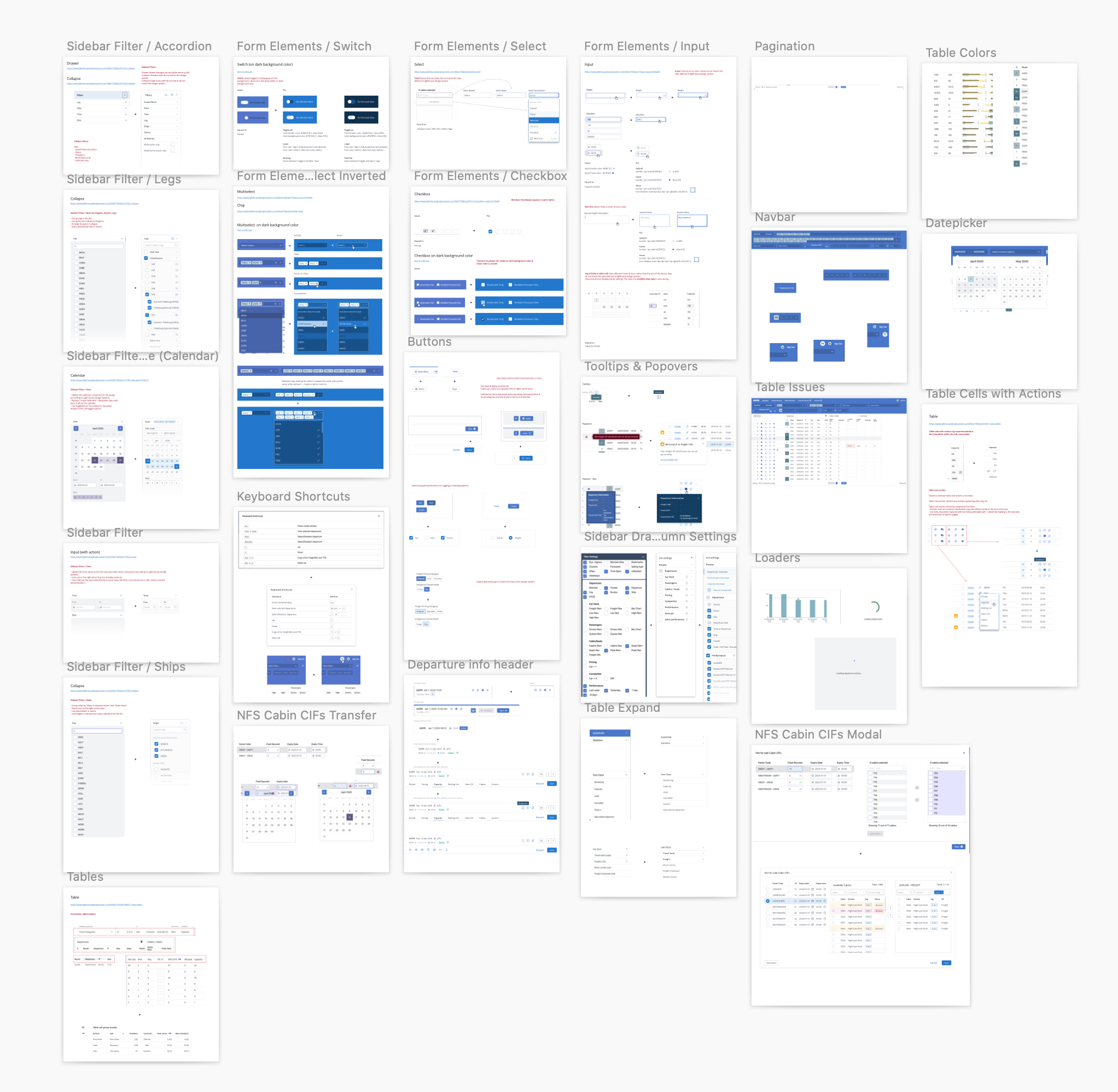
UI issues and suggested solutions. I used an artboard for each problem/solution and created a task in the backlog for all of them.
Results
By the end of the project, Nemo had become an essential tool within Stena Line. Trade managers now had a unified dashboard to do in minutes what used to take hours across various files and systems. The process of optimizing a sailing – adjusting prices, shifting capacity, reviewing forecasts – became more data-driven and transparent.
Equally important, the initiative paved the way for a more design-centric culture in Stena Line’s internal development. The Lighthouse Design System we created was adopted by multiple teams, bringing consistency to many internal applications beyond Nemo. In short, Nemo not only solved the immediate problem (simplifying trade management) but also contributed to Stena Line’s broader digital transformation, moving the company closer to its “cognitive ferry” vision.
Key Learnings
Simplify complexity
In a data-rich, complex domain, simplifying the user experience is paramount. We learned to break down complex workflows into digestible steps and surfaces. By deeply understanding our users (through techniques like Impact Mapping and user interviews), we were able to present information in a way that felt manageable rather than overwhelming. This project reinforced that even the most complicated processes can be made user-friendly if you focus on the core tasks and present information clearly.
Collobration is the key
Building Nemo underscored the importance of cross-team collaboration. We had designers and developers working hand-in-hand, and even multiple product teams aligning thanks to the design system. By establishing a shared design language (the Lighthouse Design System) and involving stakeholders throughout the design process, we broke down silos. This collaboration not only made the design better; it also created buy-in and shared ownership of the end product across the organization.
Prototype and Iterate
Never underestimate the power of prototyping and early feedback. Our bi-weekly demo sessions became a cornerstone of the project’s success. Regularly showing prototypes to actual users meant we caught usability issues early and often. We could iterate rapidly, adapting the product to user needs before heavy development resources were invested. This agile, user-centered approach ensured that by the time features went live, they were already vetted and approved by the users, resulting in higher satisfaction and adoption.
Embrace Change with Strategy
Implementing a major design overhaul (like introducing a design system) in the middle of product development is daunting, but possible with the right mindset. We embraced an agile, “move fast” approach – implementing changes incrementally and fixing issues as they arose – rather than waiting to deliver a perfect, complete system. The lesson here is that big improvements often come with some disruption; the key is to manage that change strategically. By prioritizing critical fixes and continuously communicating with the team and stakeholders, we turned a potentially chaotic process into a highly productive one. In the end, the willingness to “break things” in a controlled manner led to a far superior product.
Selected Works
Tillväxtverket - Kompass Design SystemDesign System
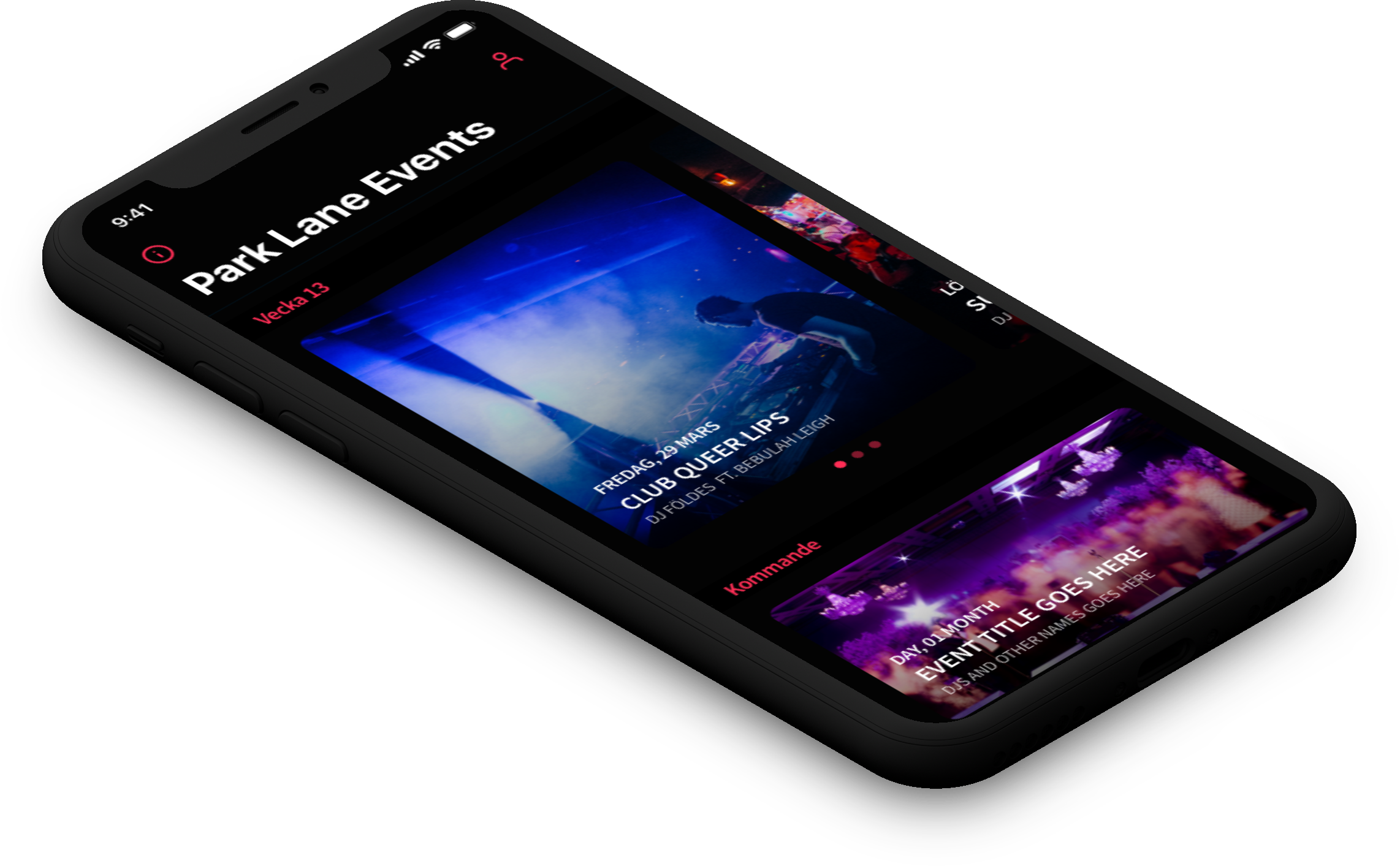
Park LaneMobile App
Lighthouse Design SystemDesign System
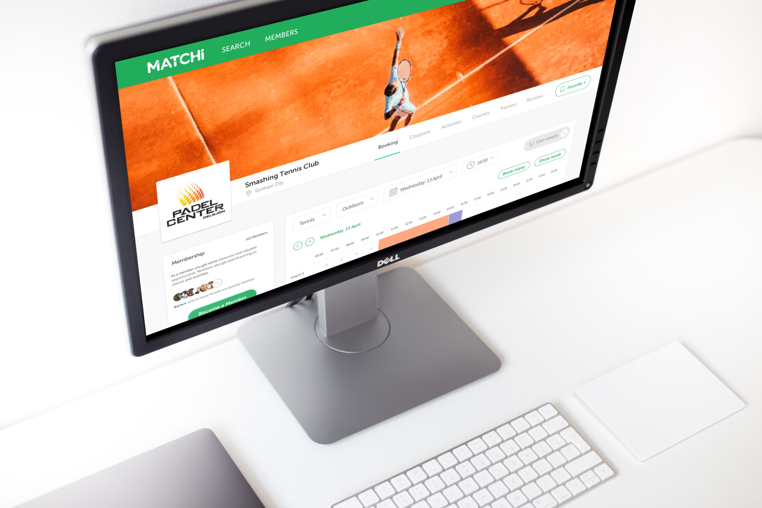
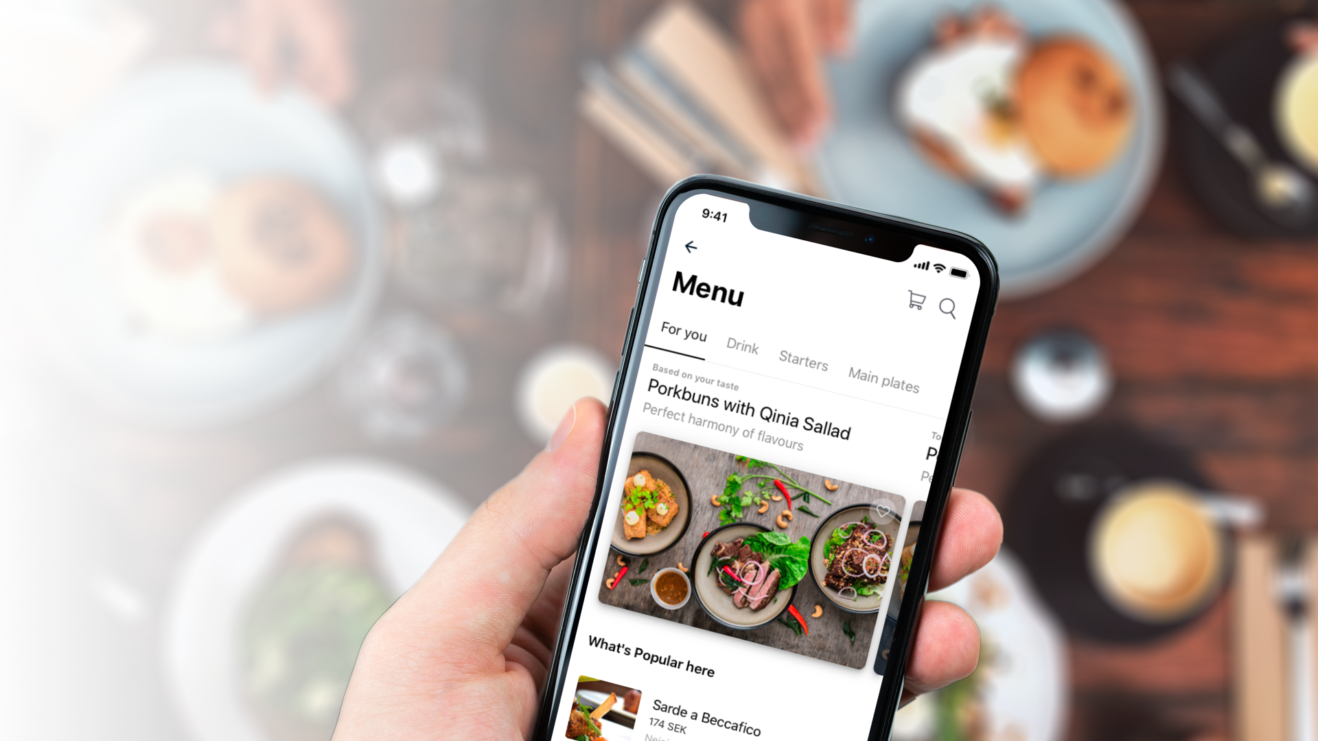
MatchiWeb App
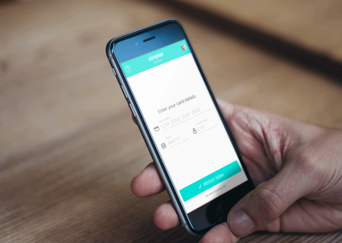
Zimpler - Mobile PaymentsResponsive Design
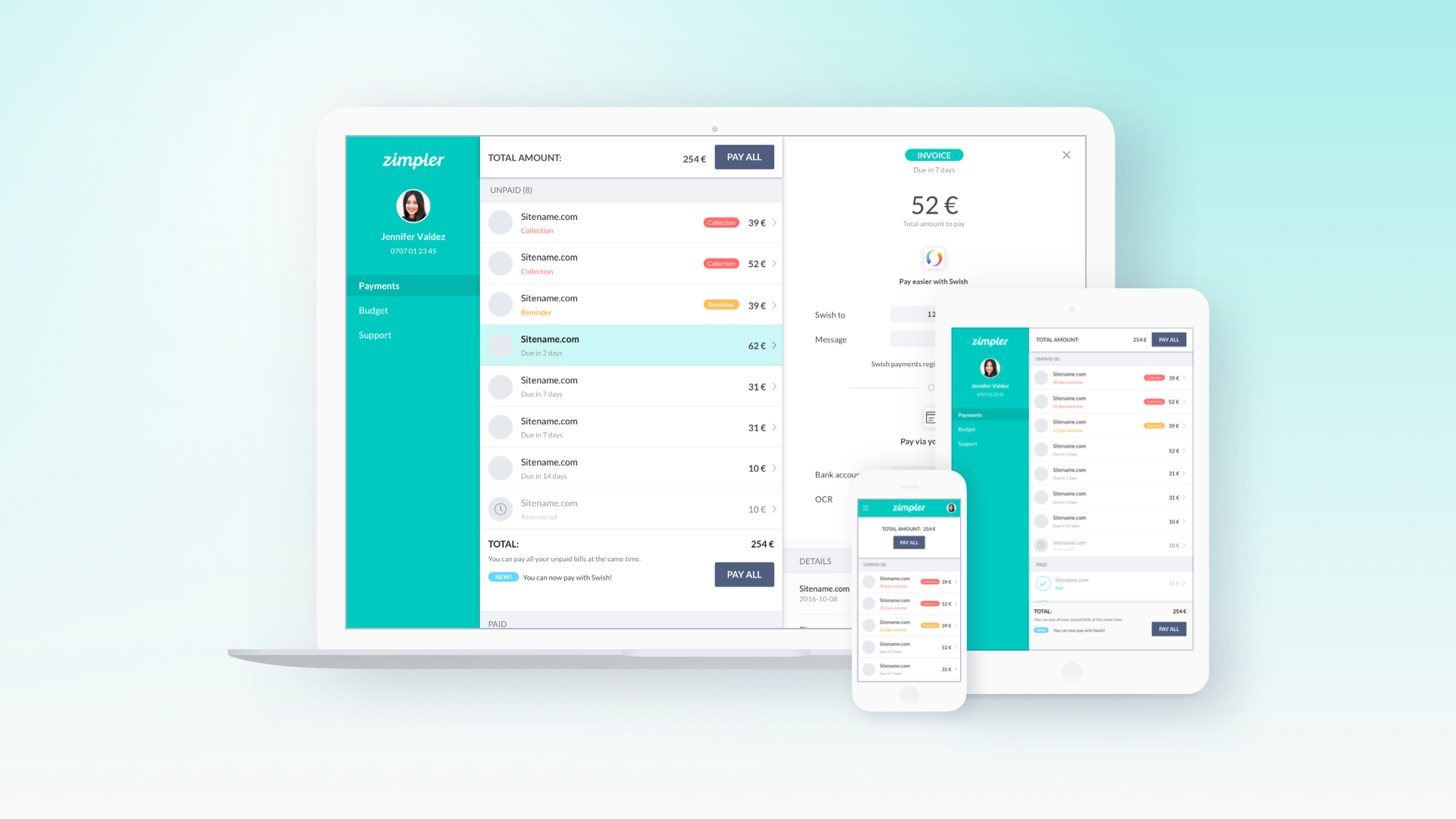
Zimpler - User PortalWeb App
QitchMobile App
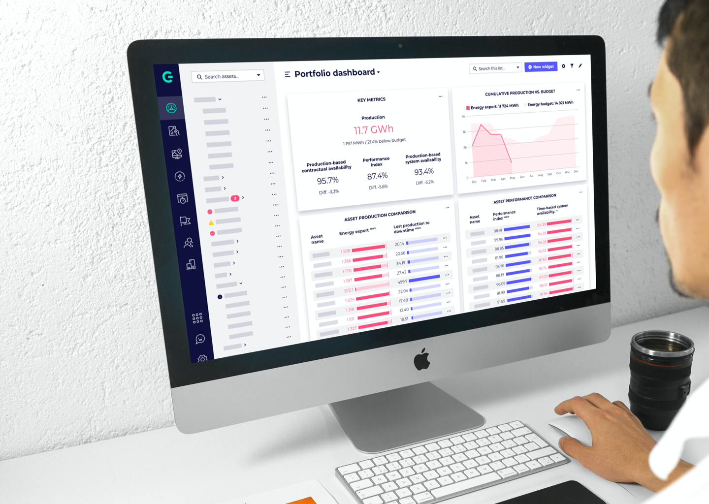
GreenbyteWeb App Dashboard
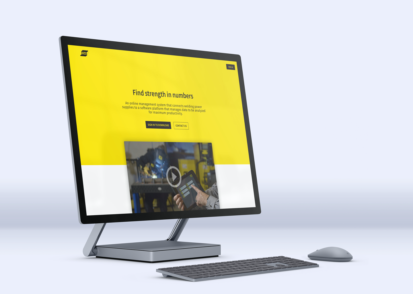
Esab - WeldCloudWeb App

Butlr.net - The Help NetworkWeb App
Contact
If you’re looking to hire a product designer, I’d love to chat. I particularly enjoy working with small to medium-sized companies that have an excellent culture. Let’s connect!