Overview
Alongside Zimpler’s mobile payment solution, we realized users would benefit from a portal to manage their transactions after making payments. The Zimpler User Portal is a web application that serves as a companion to the Zimpler checkout. It allows Zimpler’s customers (end-users) to log in and see all their payment activity, especially focusing on invoice payments since Zimpler originally started as an invoice-based payment method. I worked on designing this portal to make sure users could easily view and pay their outstanding invoices, review their payment history, and manage any account settings or limits.
Challenge
In Zimpler’s early days, the service was primarily an invoice payment solution. For example, a user on a gaming site could choose to pay via Zimpler, and essentially that meant Zimpler would front the payment and then send the user an invoice to settle later (a “buy now, pay later” model). As this took off, Zimpler needed a place for users to see and pay those invoices at their convenience. Initially, after a purchase, a user would just receive a text message with a payment link or details – but if they had multiple invoices or wanted to check their status, there wasn’t a dedicated interface for that.
So the challenge was to create a self-service portal where users could:
- See all their invoices in one place (whether paid or unpaid).
- Check the status of each (e.g., paid, due, overdue).
- Make payments for open invoices directly through the portal.
- View their overall transaction history (including any card payments or other methods if available).
- (Eventually) manage things like spending limits or budgets for themselves.
Another challenge was ensuring this portal was mobile-responsive. Many users would come to it via their phone (say, clicking the link from an SMS). We wanted it to work nicely on small screens and larger screens alike.
Solution
We designed the Zimpler User Portal as a responsive web app with a mobile-first mindset. That means we prioritized how it should look and function on a smartphone, and then scaled up the design for desktop views. The portal’s design is very much in line with Zimpler’s clean and simple style – it feels like an extension of the checkout flow but with more information available when needed.
User flow
Here’s how the portal works and what we focused on:
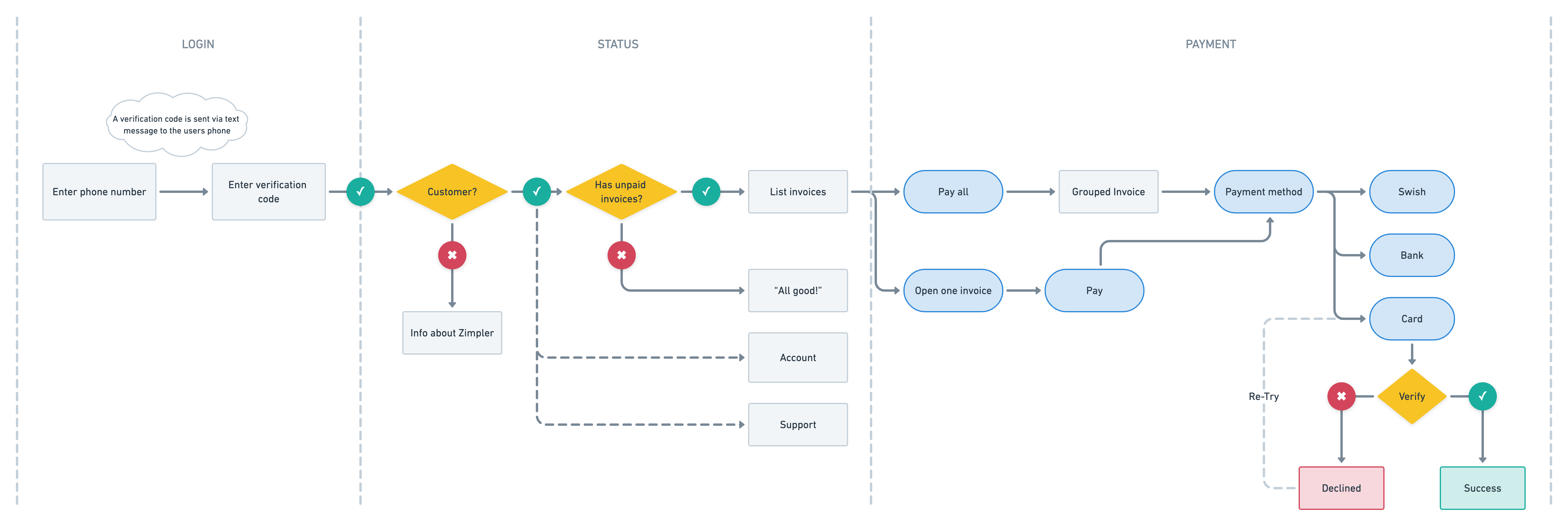
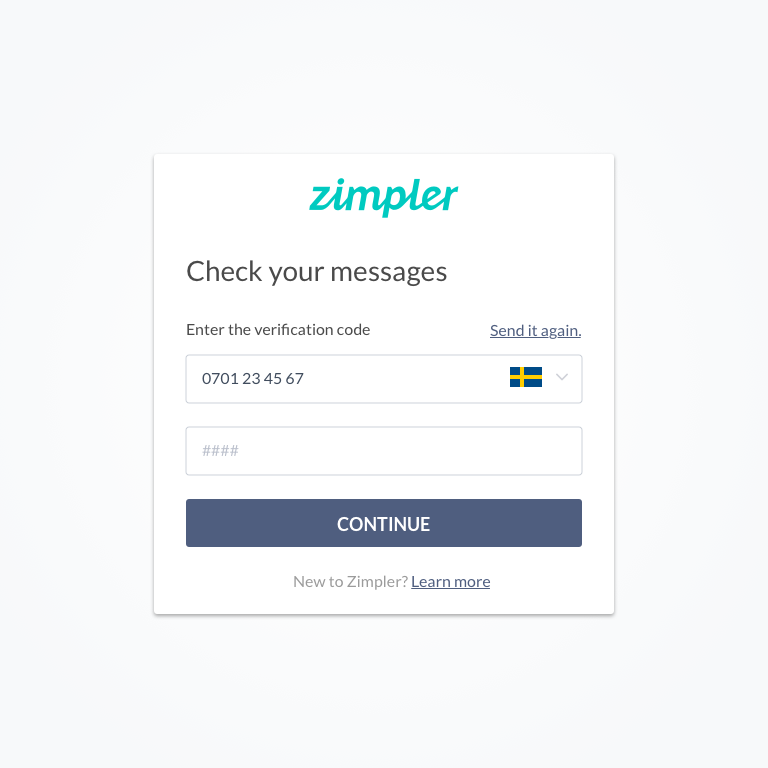
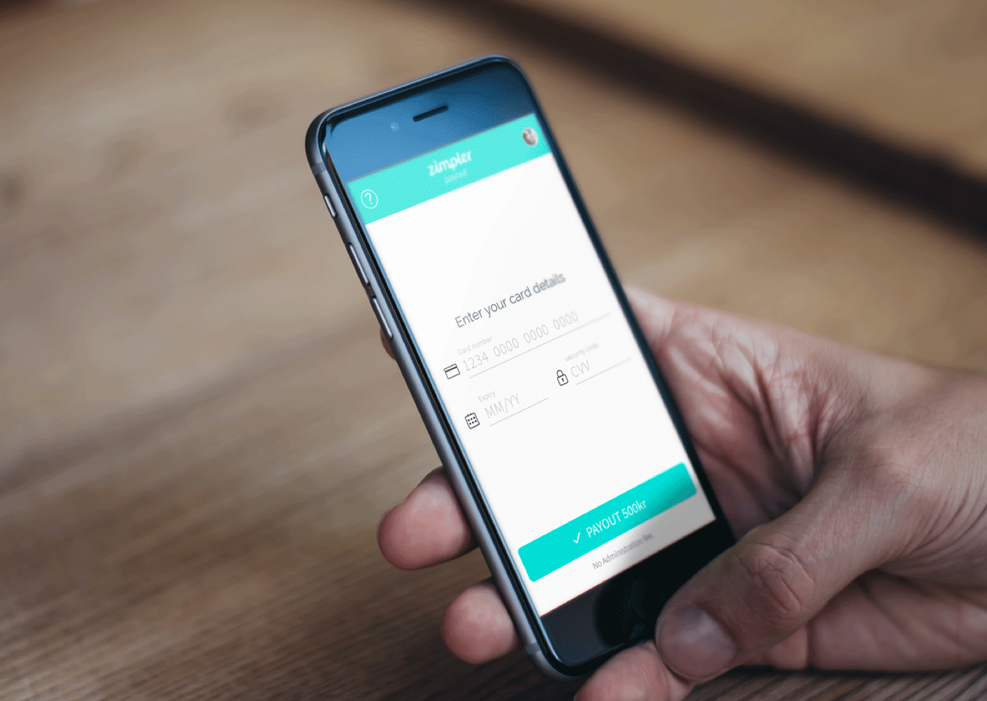
Seamless Login: Users access the portal typically by clicking a unique link they receive via SMS or email when they owe a payment. For security, each invoice had a unique link (a token) that would take the user straight to that invoice’s page without requiring a traditional login. Additionally, we offered a way to log in with BankID (a secure digital ID in Sweden) so a user could authenticate and see all their data. The design kept this simple: one click on “View My Invoices” would prompt BankID verification, and then the user is in.
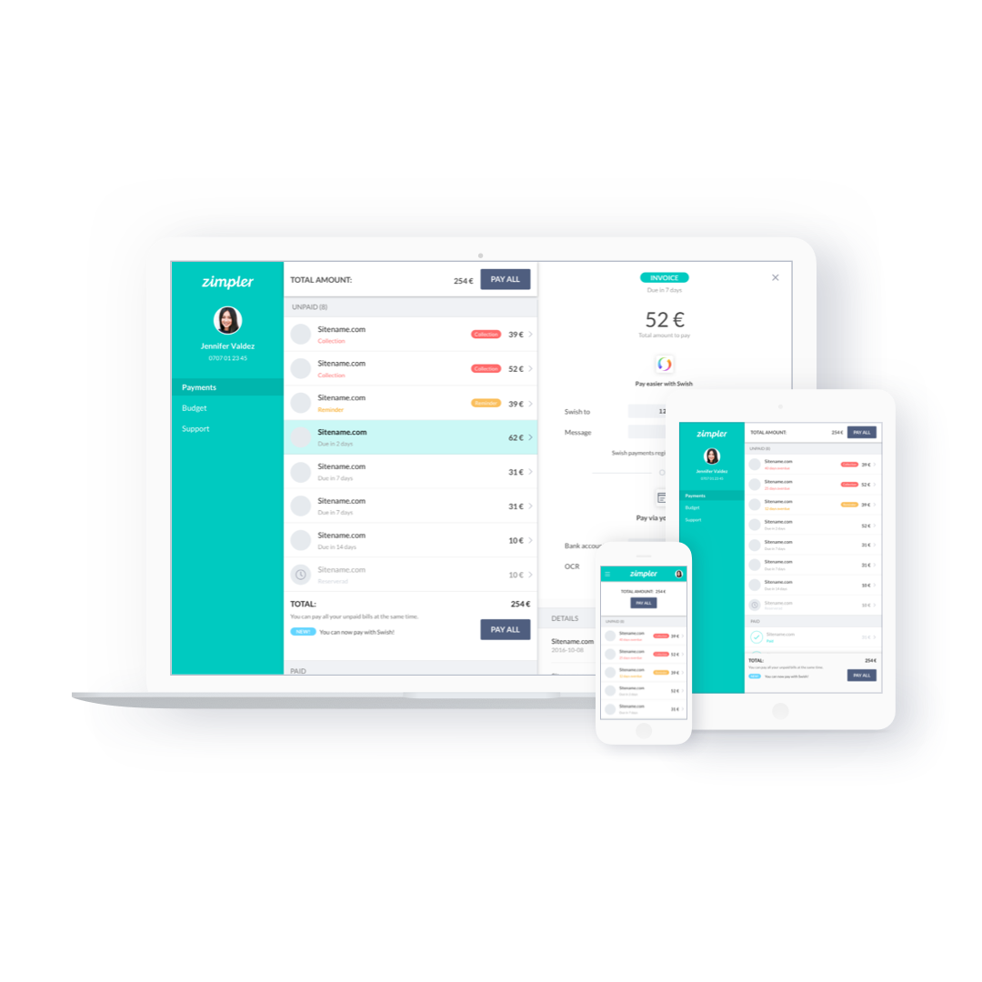
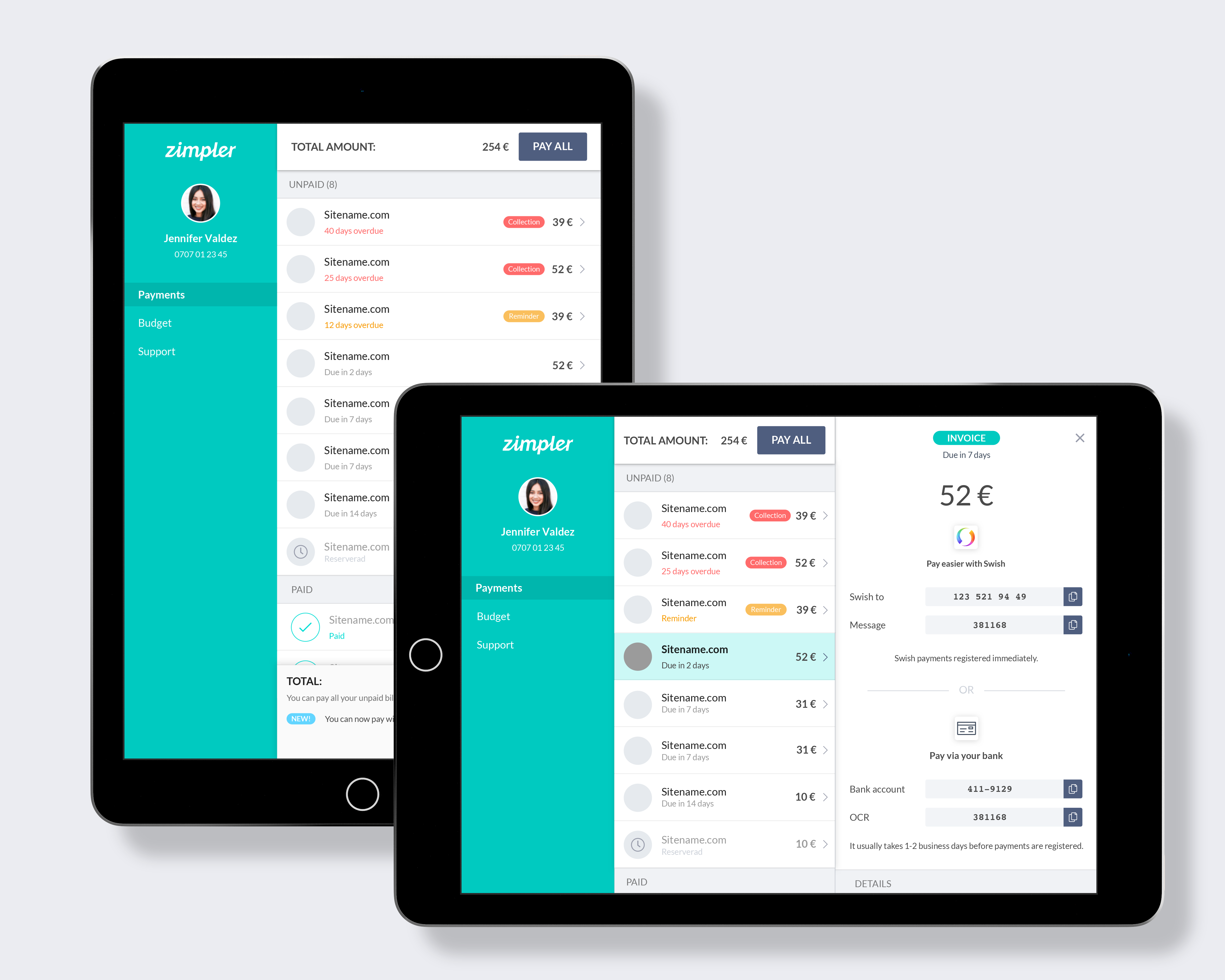
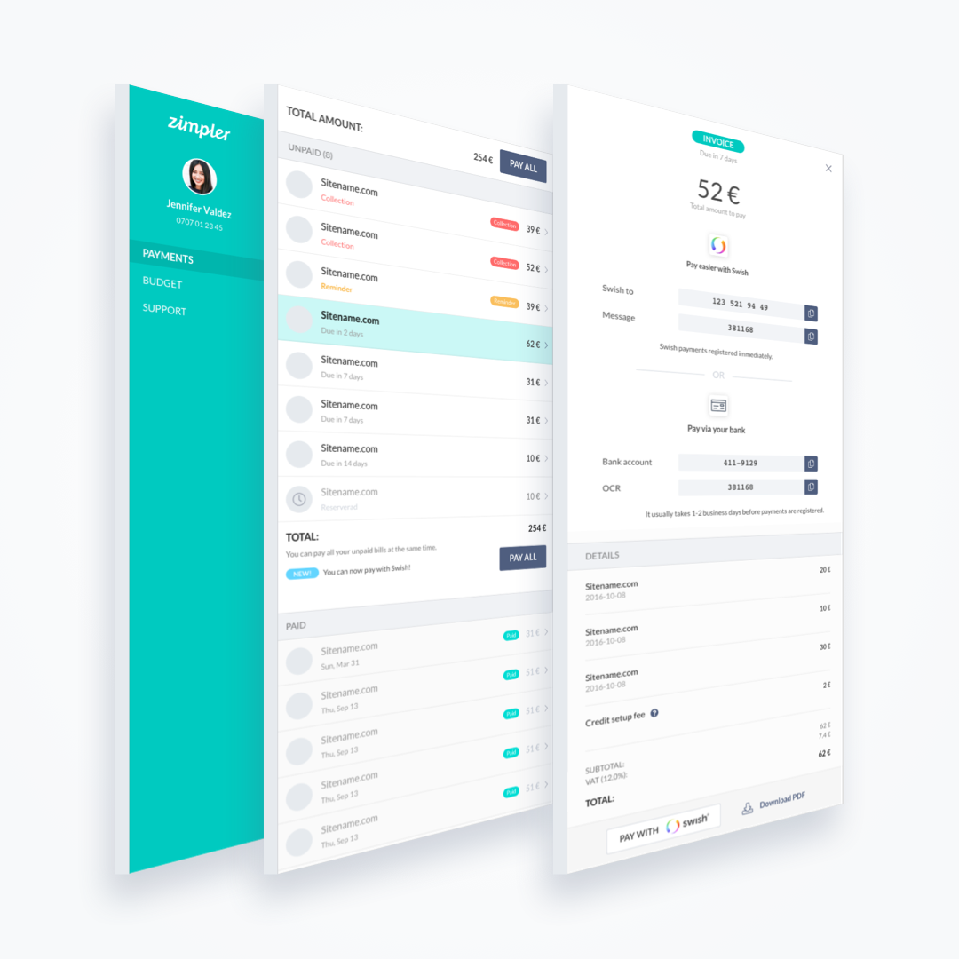
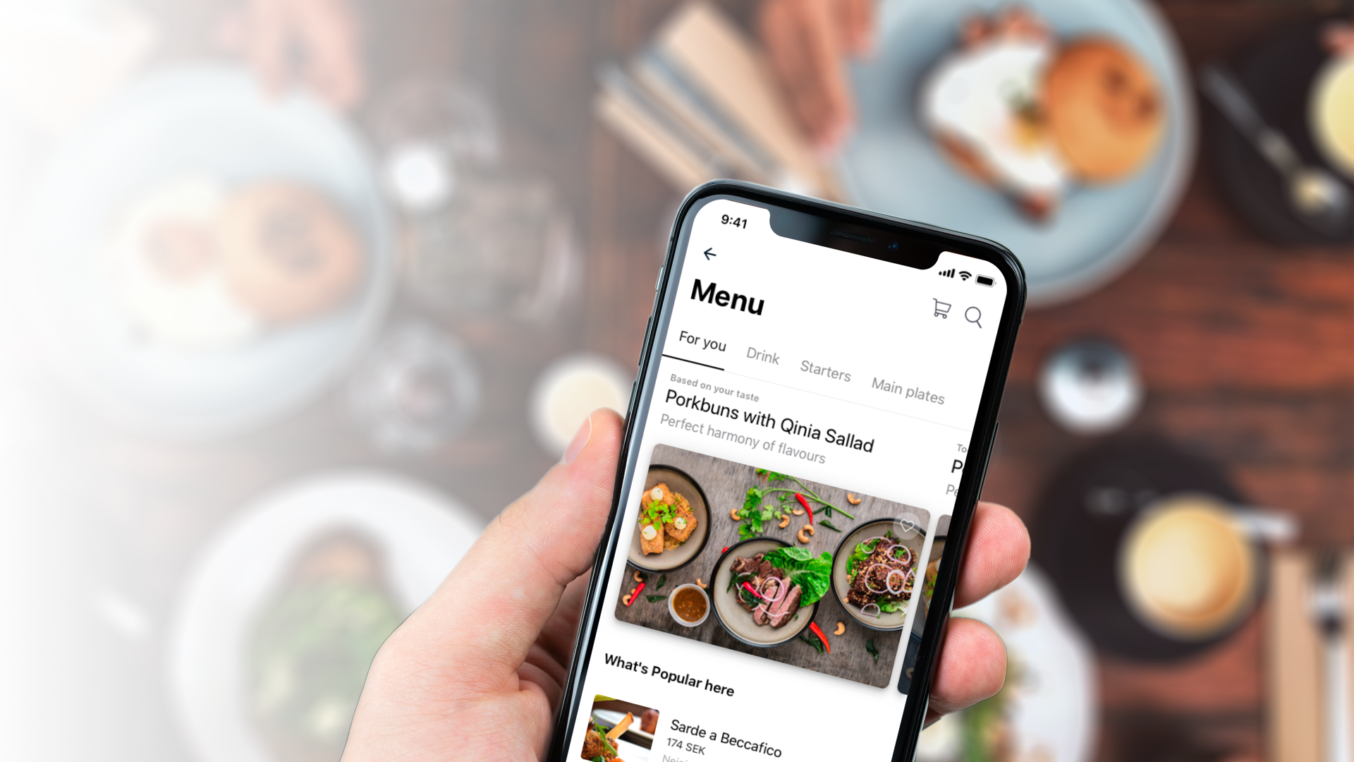
Invoice Overview: Upon entering, if on a mobile screen, the user is likely taken directly to the details of their most urgent invoice (for example, an unpaid invoice due soon). This way, the experience is laser-focused – you see the amount, due date, and a “Pay Now” button immediately. On a larger screen (like a desktop or tablet), we implemented a split-view interface: a sidebar or left pane listing all recent invoices, and a main area on the right showing the details of the selected invoice. This split view allows users to switch between invoices easily, which is convenient if they have multiple outstanding payments. The responsive design intelligently switches between these modes (list view vs. single view) depending on screen width.
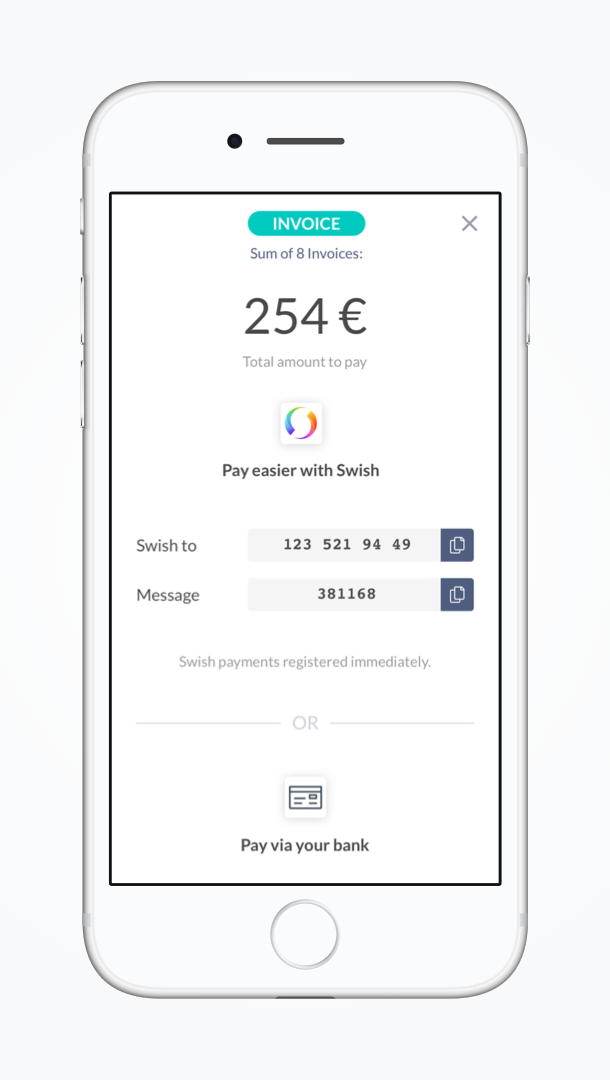
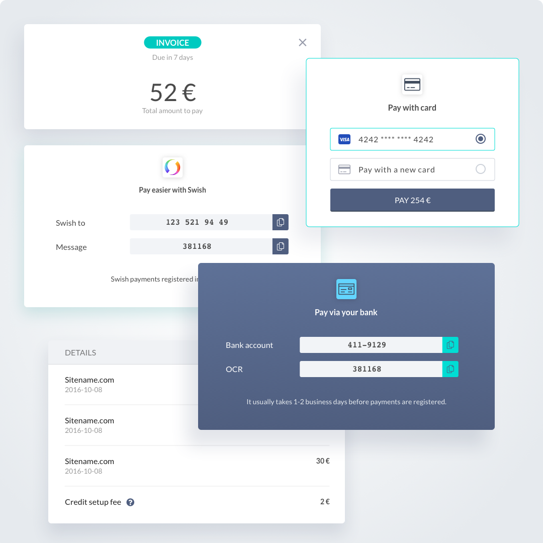
Invoice Details and Payment: The invoice detail view presents all the key information: merchant (where the charge originated), date, amount, and status (e.g., “Unpaid – due in 5 days” or “Paid on Jan 10, 2025”). It also shows payment options. We included a clear “Pay Now” call-to-action for unpaid invoices. Users could pay directly through the portal – since Zimpler knows their phone and perhaps has their card on file from the checkout, paying might be as simple as confirming via BankID or entering card details. If the user isn’t ready to pay, they at least have the info needed (including an OCR number or reference if they want to pay via their bank, for example). The design had to balance giving enough info (like reference numbers, support contact in case of issues) with keeping it user-friendly. We achieved this by hierarchy in design: important actions and info are prominent, additional details are smaller or secondary.
List of Invoices: In the list or sidebar, each invoice line item shows a summary (merchant or label, amount, and a status like “paid” or “due date”). Unpaid invoices might be highlighted or sorted to the top. This way, at a glance, a user can see if they owe something.
History and Filters: We provided a simple filter or tab system for History. A user can toggle to view “Unpaid” vs “All” invoices, or maybe “Invoices” vs “Card Transactions” if Zimpler later integrated card history as well. The interface was kept simple — likely just two tabs or a dropdown for filtering — so it’s obvious.
Budgets & Limits: Because Zimpler wanted to promote responsible spending (especially in gaming), the portal also included a section for users to set budget limits or review their spending. For example, a user might set a monthly limit on how much they can spend via Zimpler, or Zimpler might impose a limit. We created a page where users could see these limits and adjust them if allowed. The design for this uses sliders or simple input fields with explanations (e.g., “Your current monthly spending limit is X. [Change]”). It’s an optional part of the portal, but important for transparency and user control.
A responsive web app with a mobile-first mindset.
On a phone, a user clicking the invoice link would take them directly to the invoice. They could scroll to see more details or options, and a menu might allow them to navigate to history or settings. On a tablet or desktop, they might see a left panel listing all invoices (with the ability to scroll through them) and the right panel showing the currently selected invoice’s details and payment actions. We ensured that on all sizes, the critical actions (like paying an invoice or logging in) were easy to find and tap/click. If there were more than one invoice, the user could pay them all with a single "pay all" button rather that have to pay them one by one.
Outcome & Impact
The introduction of the User Portal significantly improved the post-payment experience for Zimpler’s users. Instead of wondering about an invoice or having to dig through text messages for payment info, users now had a clear, convenient place to manage everything. This self-service approach likely reduced the load on Zimpler’s customer support because users could answer their own questions (“When is my invoice due? Have I paid this? What’s my balance?”) by checking the portal.
Users appreciated the transparency: they could see their entire payment history with Zimpler and felt more in control. The ability to pay invoices online via the portal meant quicker payments and fewer reminders needed. The portal also reinforced trust in Zimpler as a brand — it wasn’t just a one-time payment gateway, but a service that cared about giving you oversight and control of your spending.
One of the key measures of success was user adoption: a large percentage of users who received an invoice started using the portal link to pay it, rather than resorting to external bank transfers. This told us that the convenience factor was high.
From a design perspective, we were happy with how the responsive design turned out. Whether users came on a phone or a computer, the experience was smooth. Internally, the project also highlighted the importance of thinking beyond the primary use-case (the checkout) and designing the supporting ecosystem (account management). By delivering the portal, we rounded out Zimpler’s product offering — it wasn’t only helping merchants get paid faster; it was also building a relationship with end-users by offering them value (an overview of their spending).
Lessons and Reflections
Designing the User Portal taught us about extending a product’s value. We learned that once you solve an immediate problem (making a payment easy), you should look at the next steps in the user journey (managing that payment and its aftermath). We discovered the power of a mobile-first approach in a slightly more content-heavy setting – proving that even a dashboard of information can be made digestible on a small screen if you prioritize and design thoughtfully.
This project also reinforced how important context is. Many users would come to the portal in a specific context (like clicking a link because they got a reminder). We made sure the design acknowledged that context (showing them exactly what they came to see first). Anticipating user needs in that way is crucial for a friendly experience.
Overall, the Zimpler User Portal became a key part of the Zimpler user experience, turning what could have been a somewhat detached payment process into a more connected financial service. It complemented the checkout and helped build user loyalty to Zimpler as they expanded their offerings.
Selected Works
Tillväxtverket - Kompass Design SystemDesign System
Park LaneMobile App
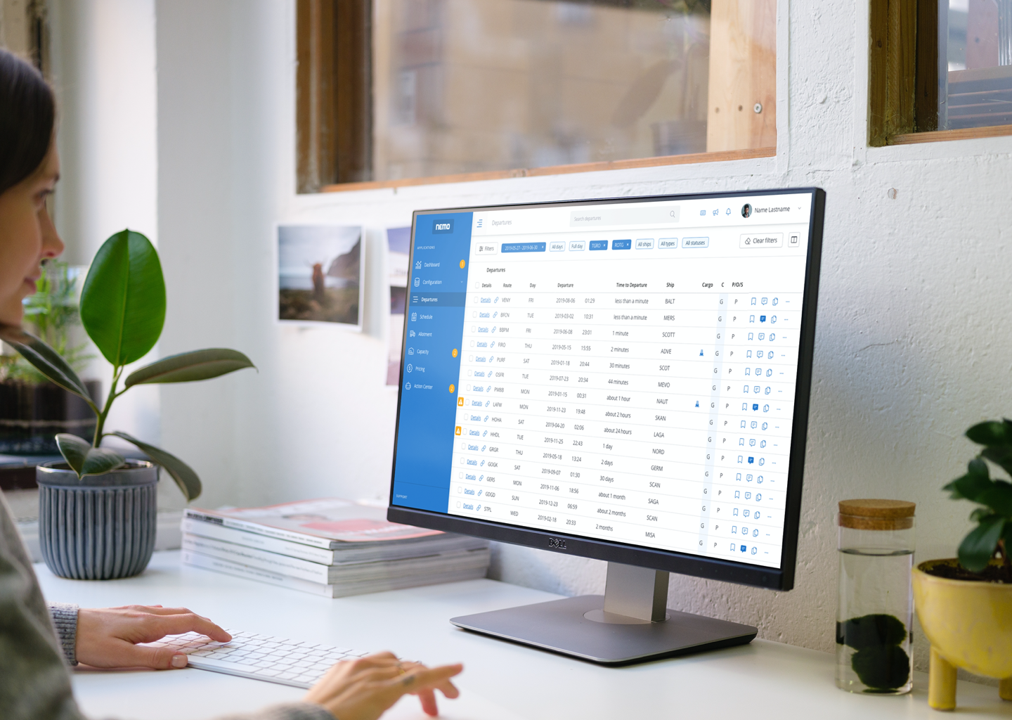
Stena Line - NemoAdmin Dashboard
Lighthouse Design SystemDesign System
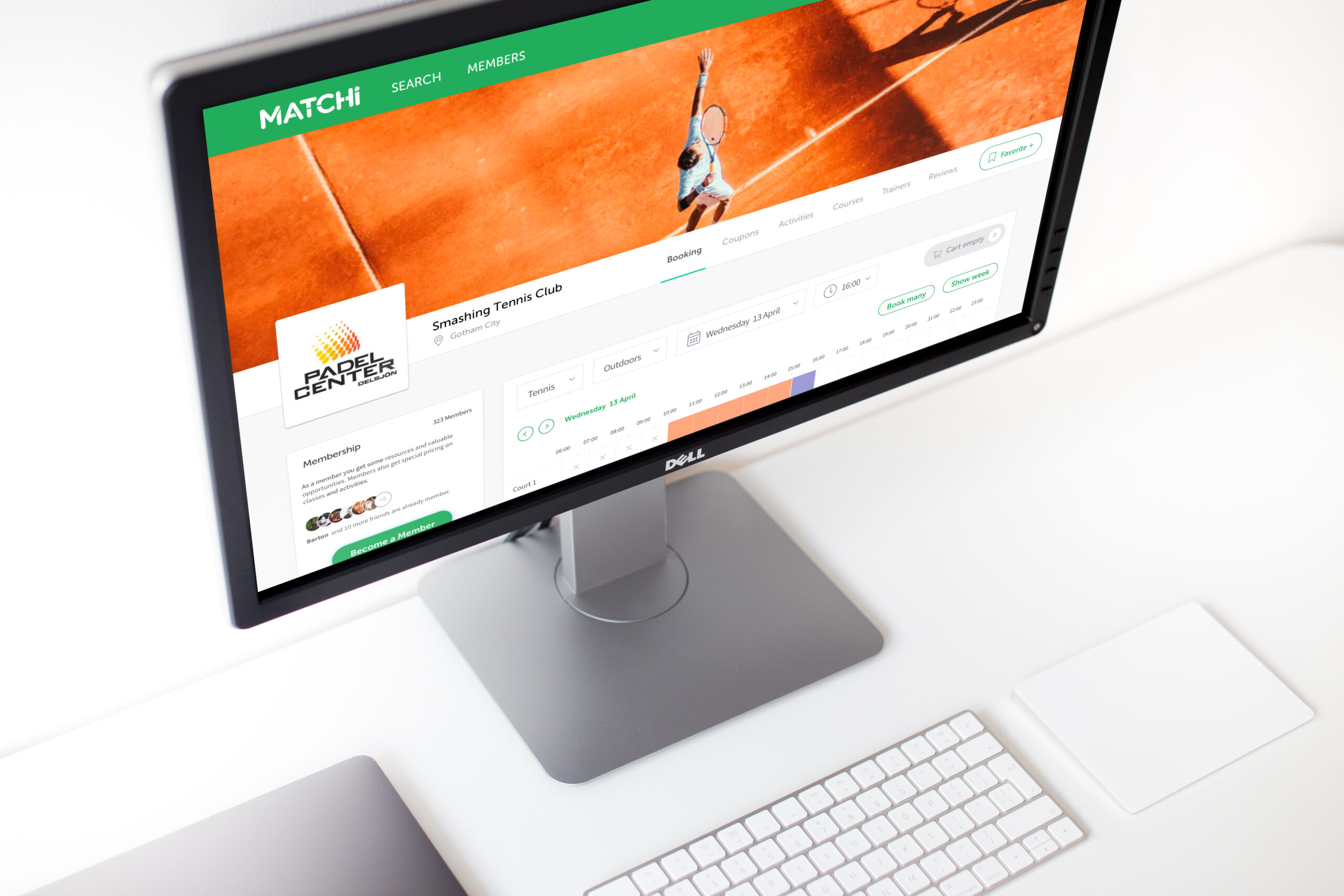
MatchiWeb App
Zimpler - Mobile PaymentsResponsive Design
QitchMobile App
GreenbyteWeb App Dashboard
Esab - WeldCloudWeb App

Butlr.net - The Help NetworkWeb App
Contact
If you’re looking to hire a product designer, I’d love to chat. I particularly enjoy working with small to medium-sized companies that have an excellent culture. Let’s connect!