Details
Overview
When I joined Tillväxtverket in early 2022 as a Senior UX Designer Consultant, the agency was coming out of the pandemic and in dire need of a coherent digital strategy. My mission? To create and implement a scalable, accessible, and user-friendly design system that would support two major web platforms:
Min Ansökan – the public-facing portal where individuals, companies, and projects apply for funding.
Nyps – the internal system where applications are reviewed and processed.
Goal
The goal was to unify the design experience, streamline workflows between design and development, and ultimately improve the efficiency and quality of our digital services. What started as a design challenge turned into a multi-year transformation journey.
Challenges
Right from the start, there was a disconnect between stakeholders’ expectations and the reality of what a design system actually is and what it requires to succeed.
- The brand guidelines were created for print, not digital – with no considerations for accessibility or responsive design.
- There were no comprehensive or consistent designs anywhere, everything was unsorted, unstructrured and never finished. No true source of truth.
- Design and development were completely out of sync. What were being designed in Figma often looked nothing like what ended up in production.
- There was resistance from both management and developers.
- Despite hiring me to build a design system, management didn’t understand its long-term value. Developers, already overwhelmed, saw it as “just about making things pretty.”
- There was no frontend ownership. No one was responsible for implementing or maintaining visual consistency in the codebase.
I had to win trust, educate, build, clean up, and unify – all while designing a system that worked across complex tools and teams.

Details
The Process
Building Kompass
I began by translating the existing (print-focused) brand guidelines into a digital-first, WCAG-compliant system. The result was Kompass – our comprehensive design system housed in Figma. It was broken down into modular libraries:
- Foundations: design principles, color system, typography, spacing
- Core: SCSS variables and design tokens
- Icons: a curated icon library
- Components: atomic, reusable UI elements
- Patterns & Templates: complex design patterns and layout scaffolds
- Views & Pages: higher-order app-specific layouts and flows
Weekly Design System Workshops
To get the team aligned, I ran weekly workshops with ~15 UX designers. Each week we tackled a new concept—from design principles and accessibility to how and why to use specific components. It wasn’t just about teaching the “what,” but explaining the “why.”
Weekly Design Reviews
I also initiated regular design reviews where designers could share work-in-progress, get feedback, and ensure alignment with Kompass. These sessions became a key forum for cross-team learning, consistency, and spotting divergence early.
Bridging the Gap to Code
As our design system matured, it became painfully clear that what we designed in Figma didn’t reflect what users experienced. There was no frontend lead, and developers didn’t have the time or understanding to recreate our components. So I rolled up my sleeves.
I dove headfirst into the Angular frontend—even though I had no prior experience. I audited and cleaned up the entire frontend codebase:
- Removed outdated and conflicting styles
- Upgraded Bootstrap and other dependencies
- Created a custom SCSS theme that matched Kompass
- Rewrote templates using semantic HTML
This alone took months and laid the groundwork for the visual transformation of both Min Ansökan and Nyps.
Solutions & Deliverables
Kompass Component Library
With the frontend cleaned up, I led the effort to implement a real Angular component library:
- Built every component from the ground up using SCSS, powered by design tokens and modular architecture
- Supported light/dark mode from the start
- Used Storybook to document, showcase, and test every component
- Wrote detailed documentation explaining design rationale and technical implementation
Developer Buy-In
To build momentum and support, I:
- Started a frontend guild – with dev reps from every team.
- Set a clear adoption strategy: use Kompass for every new ticket or project. If a component was missing, file a request and we’d build it.
- Hosted bi-weekly demos to show developers how to use the library and provide a feedback loop.
Outcomes & Impact
Despite a rocky start, we achieved a significant transformation:
- Unified visual language across both platforms
- Design production became 10x faster
- Reusable component library led to less duplication and higher quality
- Better collaboration between design and dev, reducing friction and wasted time
- Improved accessibility, performance, and usability
- Living documentation made onboarding and scaling easier
- Culture shift—Kompass wasn’t just a tool, it became a mindset
Learnings
Looking back, building Kompass was one of the most challenging yet rewarding projects of my career. I wasn’t just designing a system — I was building bridges, changing culture, and helping others grow.
Education is everything
You can’t assume buy-in. You have to earn it by explaining, showing, and involving people.
Simple is hard
Design systems can be complex, but they should feel simple to use. That’s the magic.
Consistency requires constant effort
It’s not enough to write guidelines—you need to reinforce them with feedback, support, and structure.
Scaling design requires a shift in mindset
A design system isn’t just a library—it’s a product that requires maintenance, communication, and advocacy.
Removing is harder than adding
Be intentional about what goes in the system. Every component has a maintenance cost.
Code doesn’t lie
A design system is only real when it’s implemented. Visual polish means nothing if users don’t experience it.
In the end, I’m incredibly proud of what we built. Kompass helped raise the design maturity of Tillväxtverket, empowered the UX team, and laid a scalable foundation for future development. It wasn’t easy—but it was absolutely worth it.
Selected Works
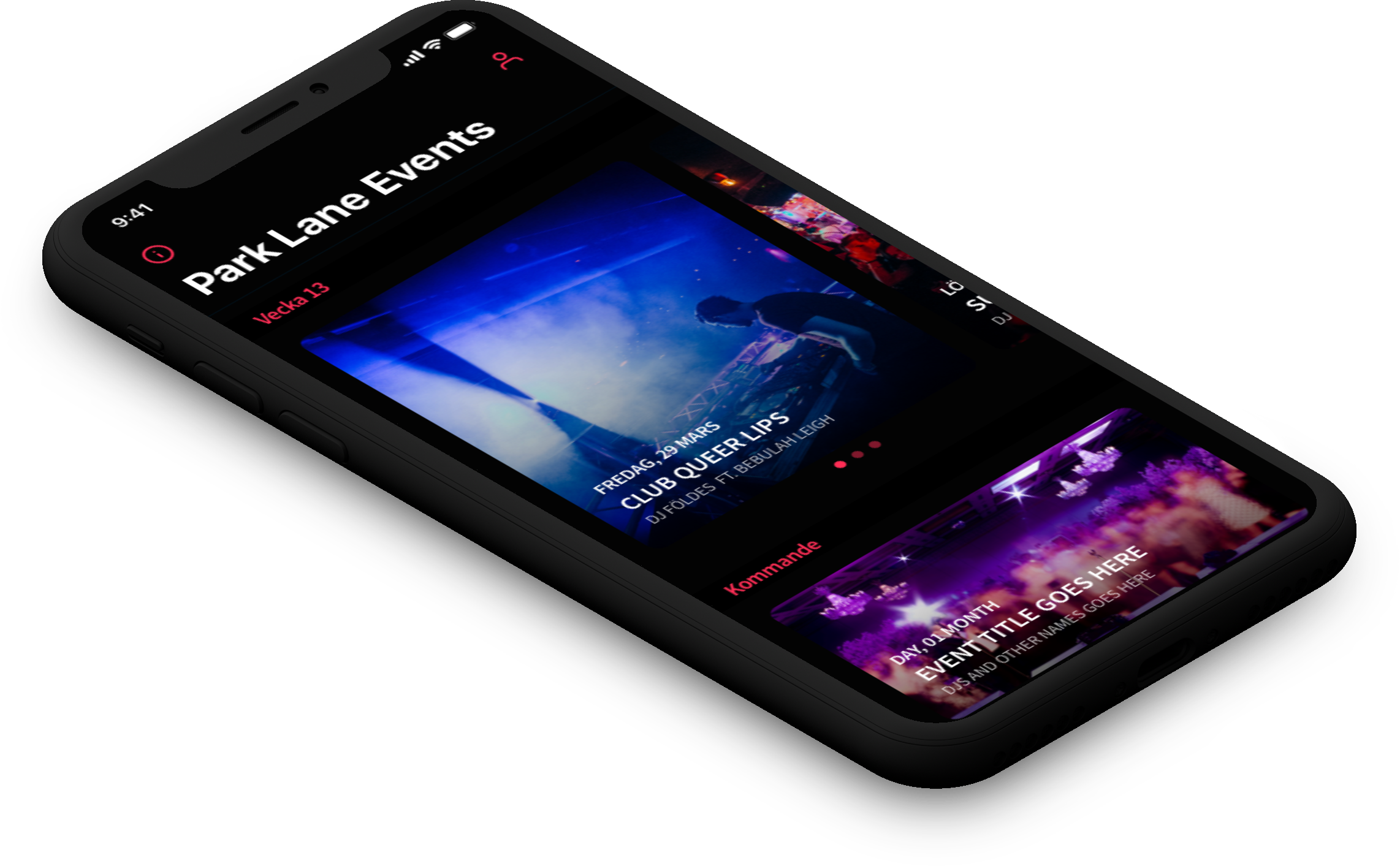
Park LaneMobile App
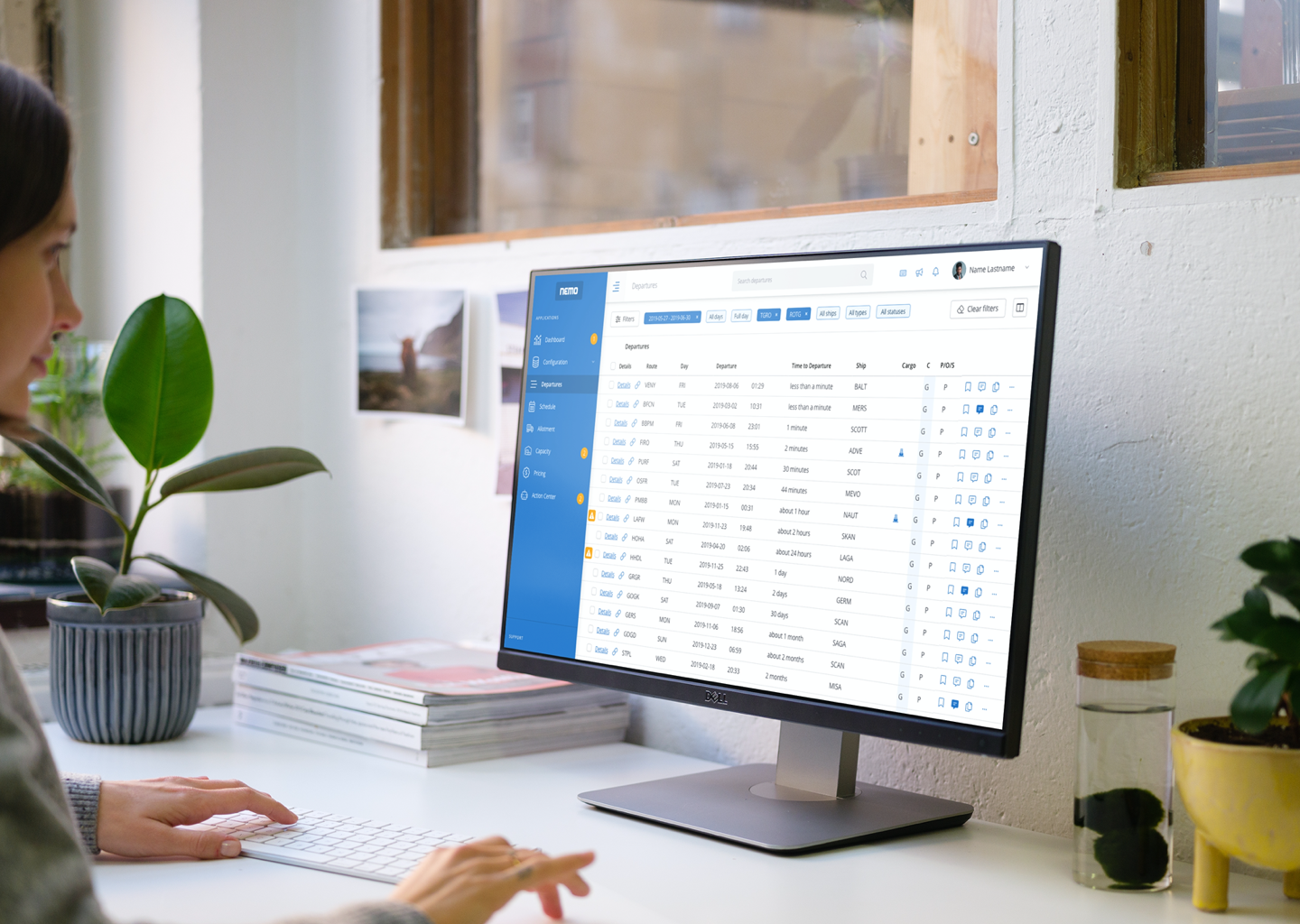
Stena Line - NemoAdmin Dashboard
Lighthouse Design SystemDesign System
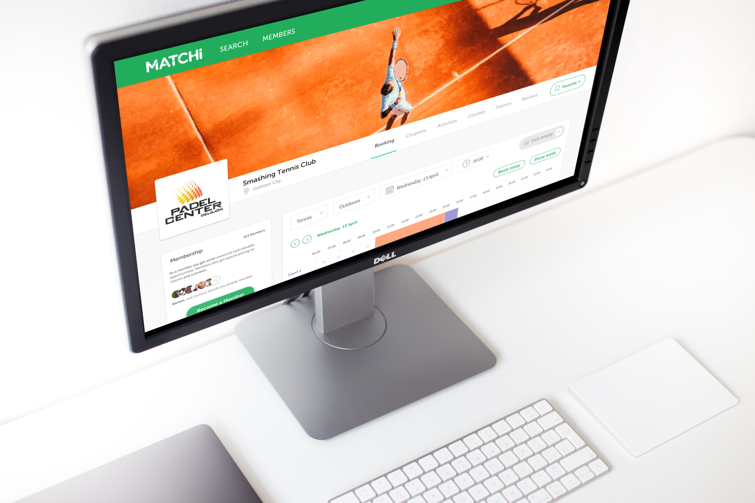
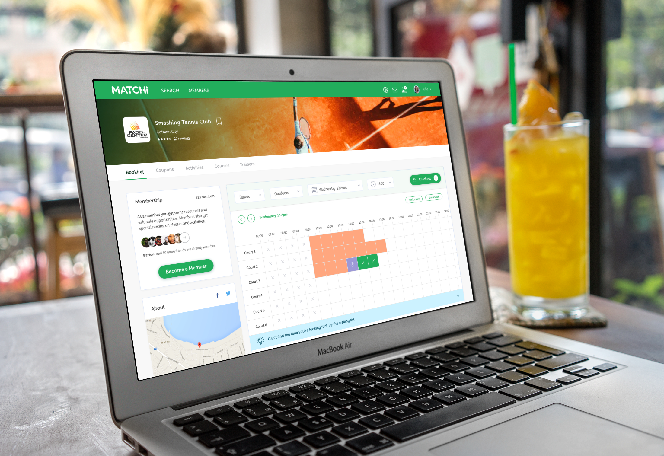
MatchiWeb App
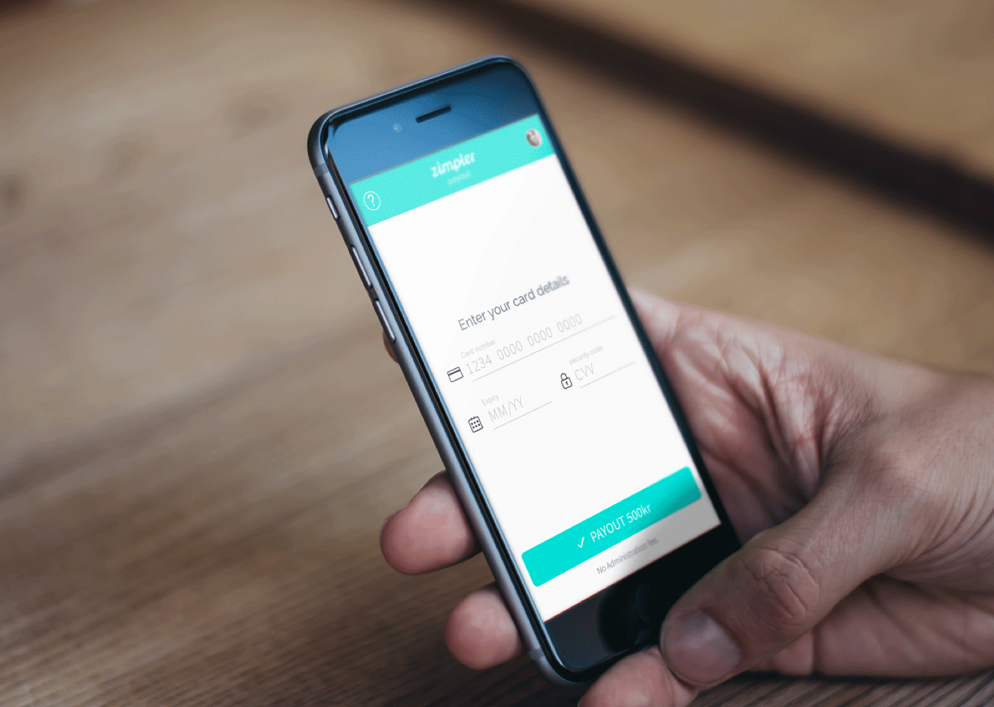
Zimpler - Mobile PaymentsResponsive Design
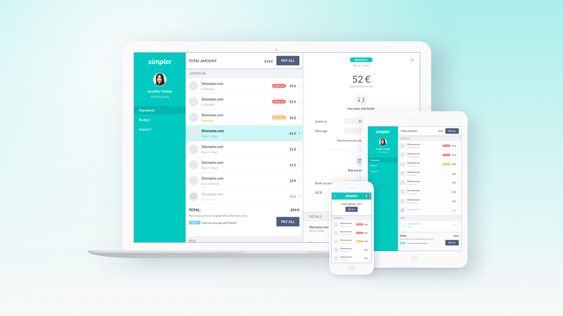
Zimpler - User PortalWeb App
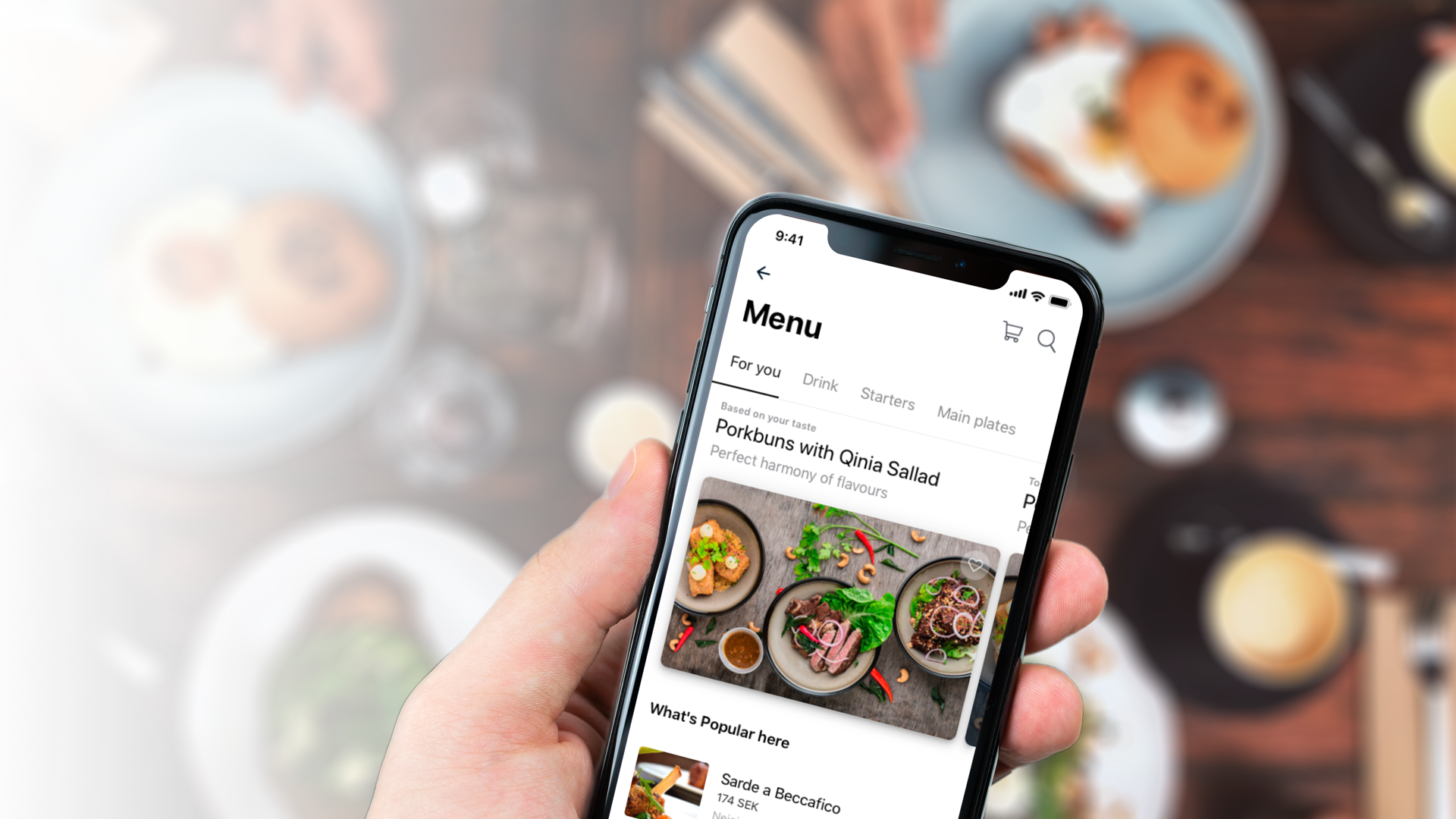
QitchMobile App
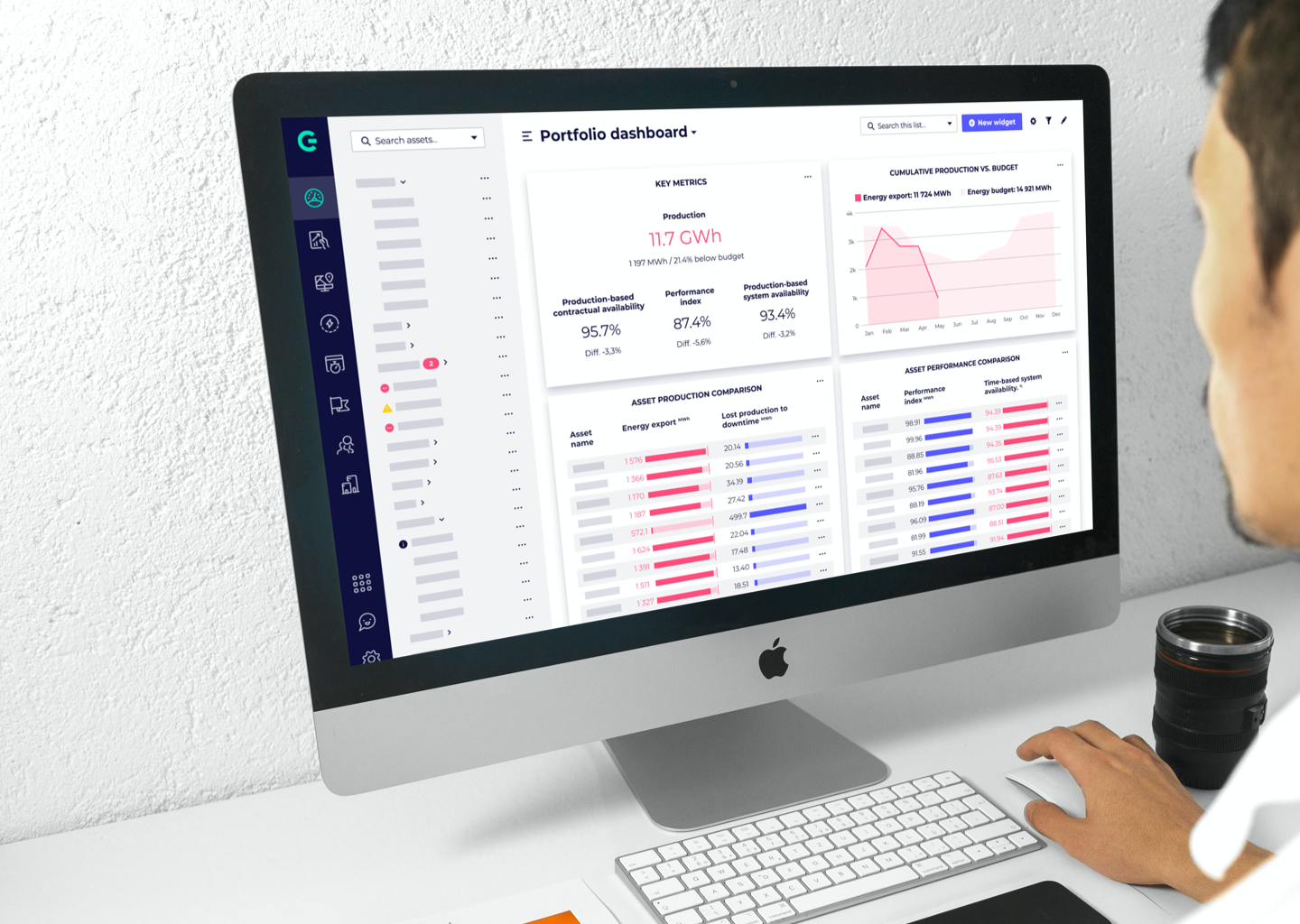
GreenbyteWeb App Dashboard
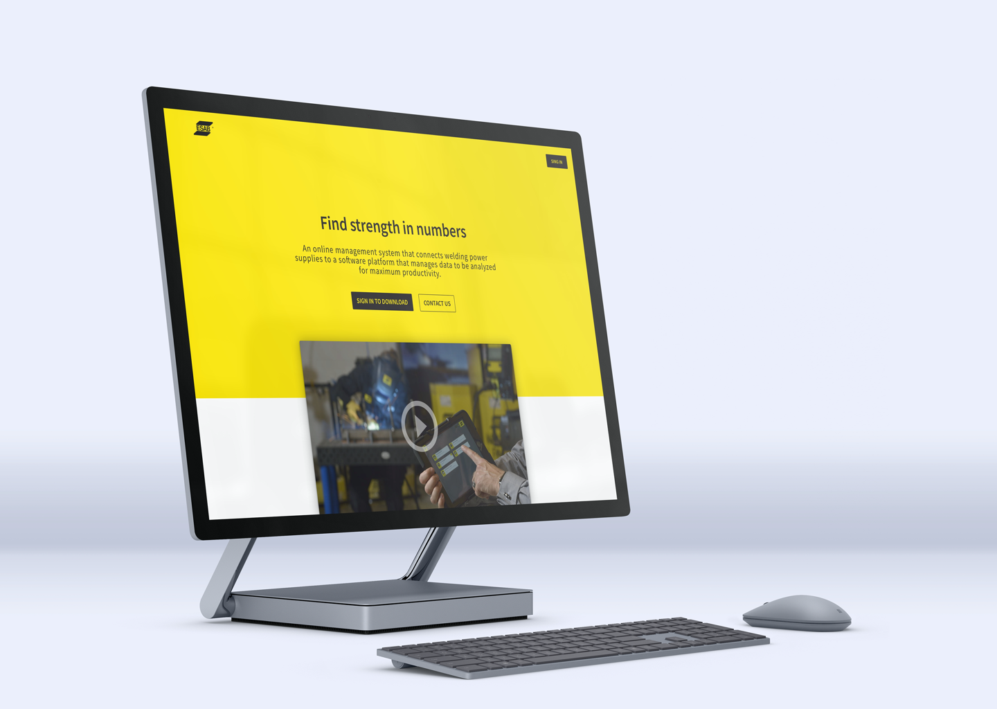
Esab - WeldCloudWeb App

Butlr.net - The Help NetworkWeb App
Contact
If you’re looking to hire a product designer, I’d love to chat. I particularly enjoy working with small to medium-sized companies that have an excellent culture. Let’s connect!